In the pages of the art books that we design the artworks always play the main role. An art book should complement the artist’s aesthetic and worldview, while giving the works their own distinctive frame of reference.
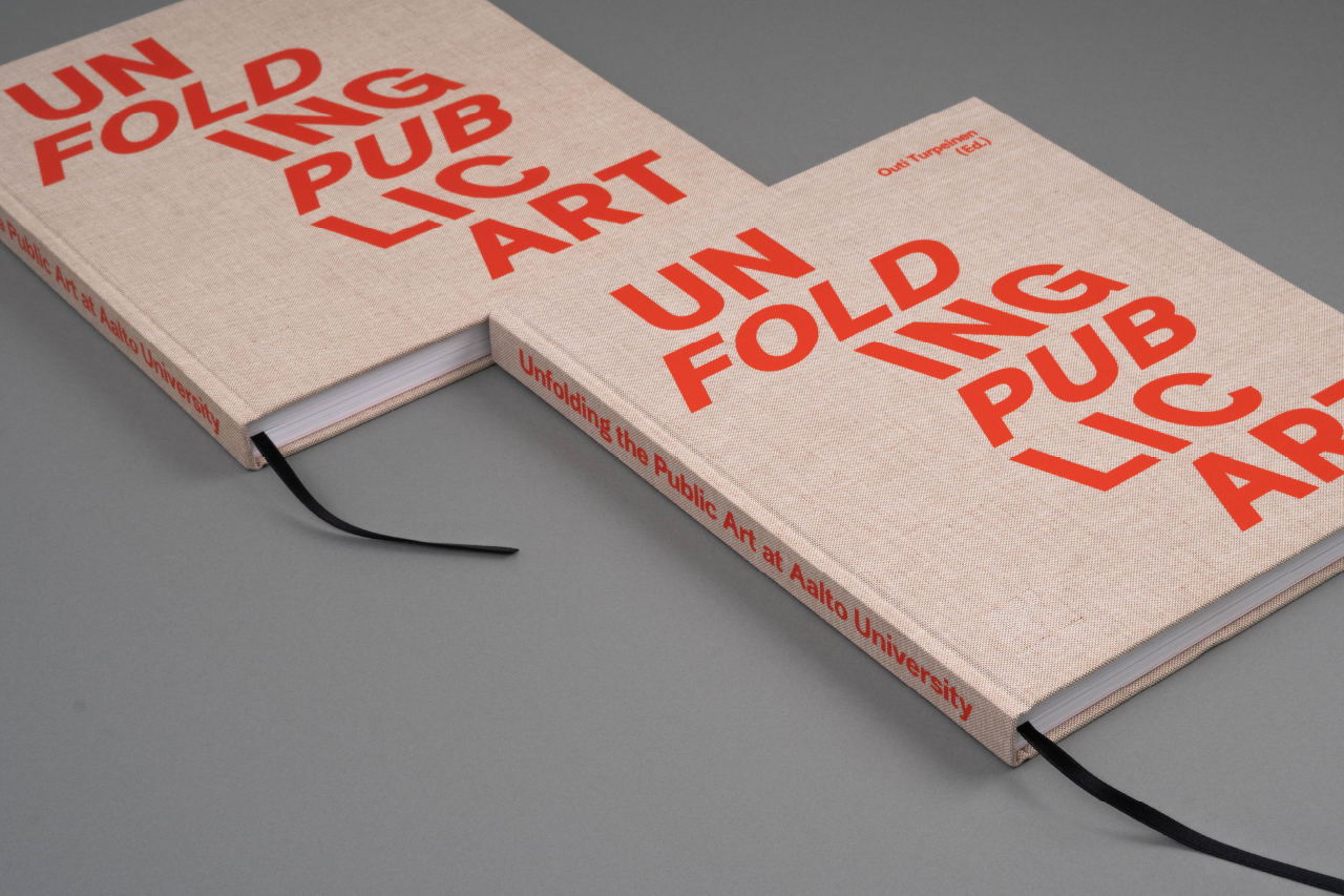
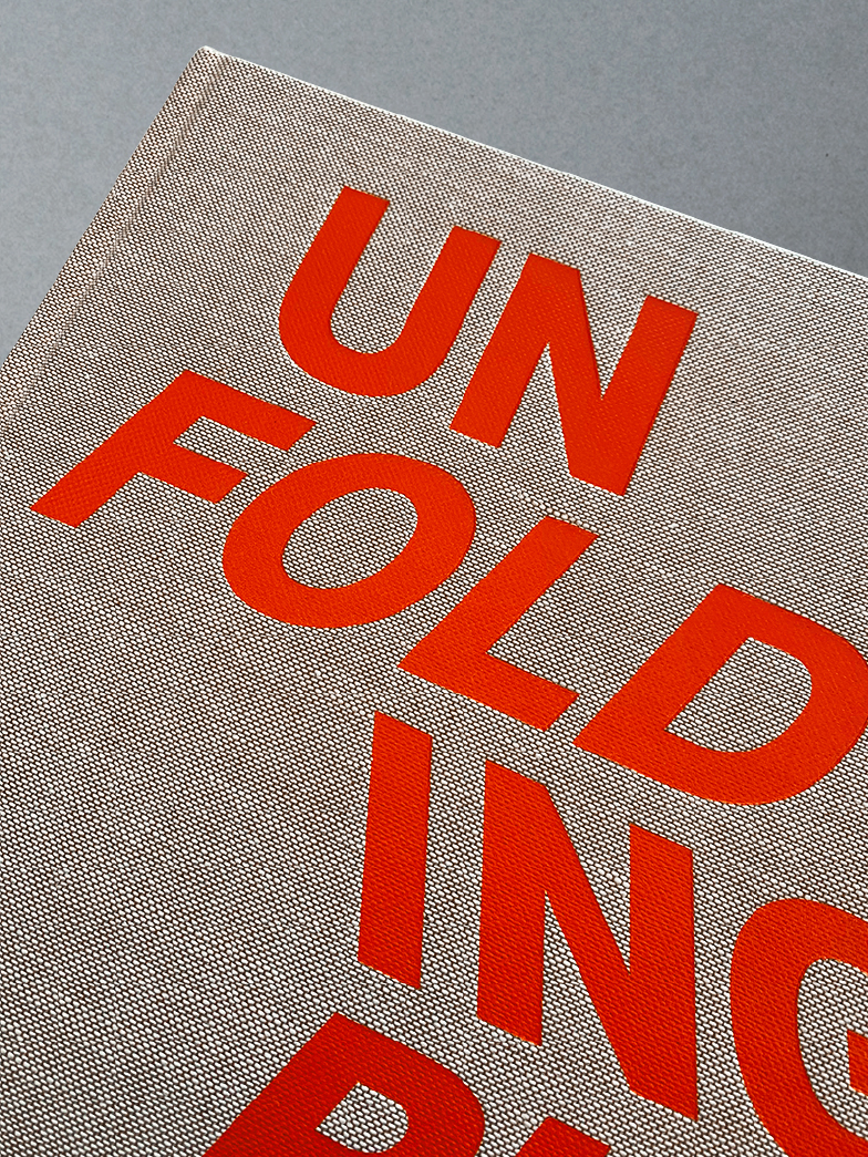
Unfolding the Public Art
at Aalto University
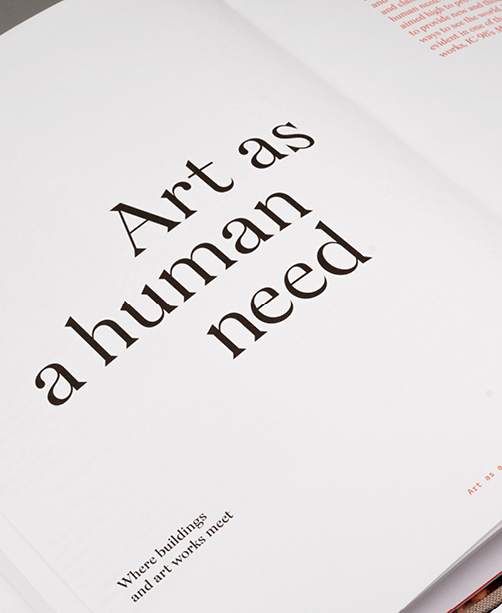
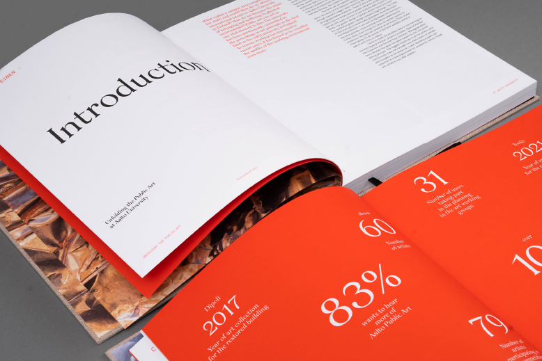
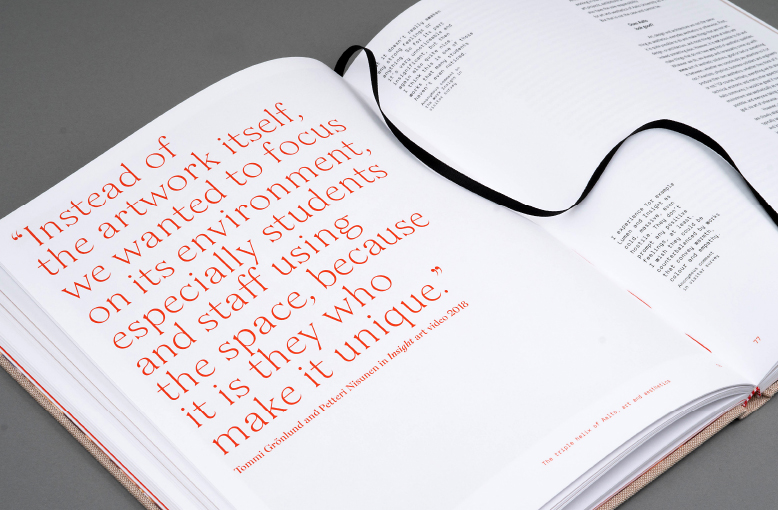
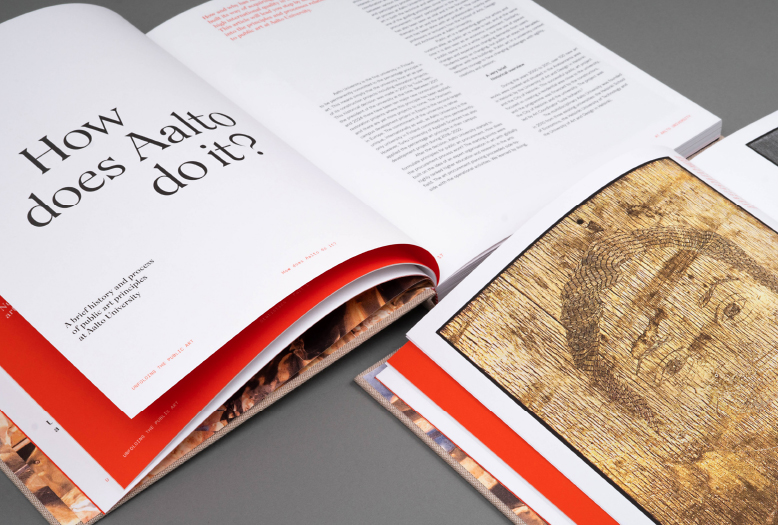
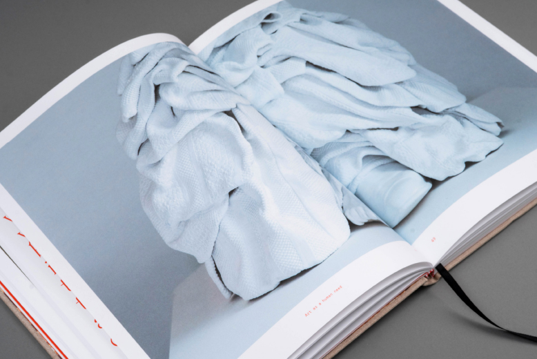
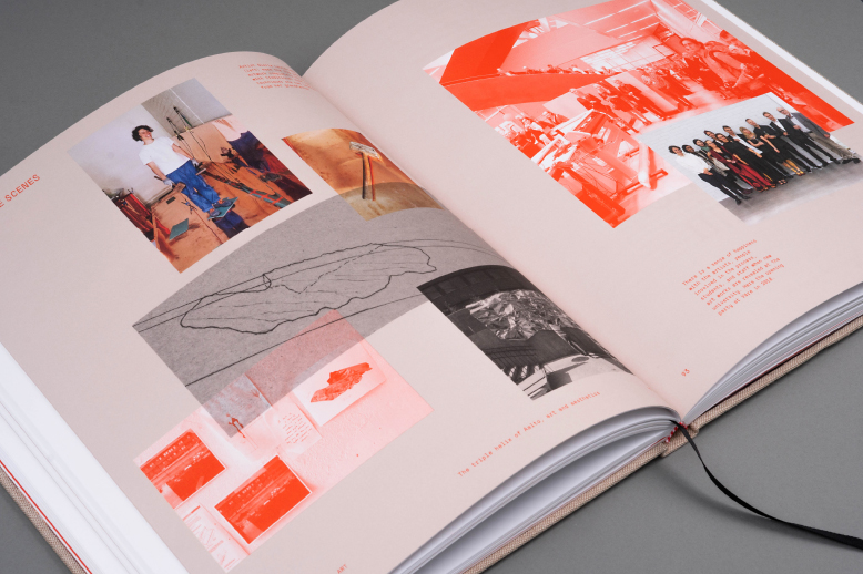
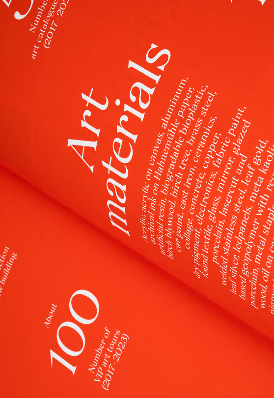
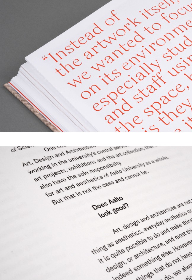
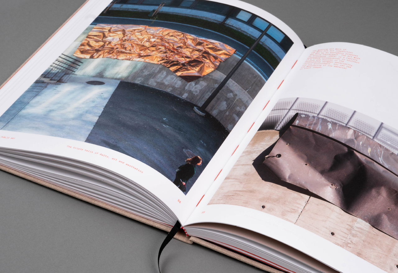
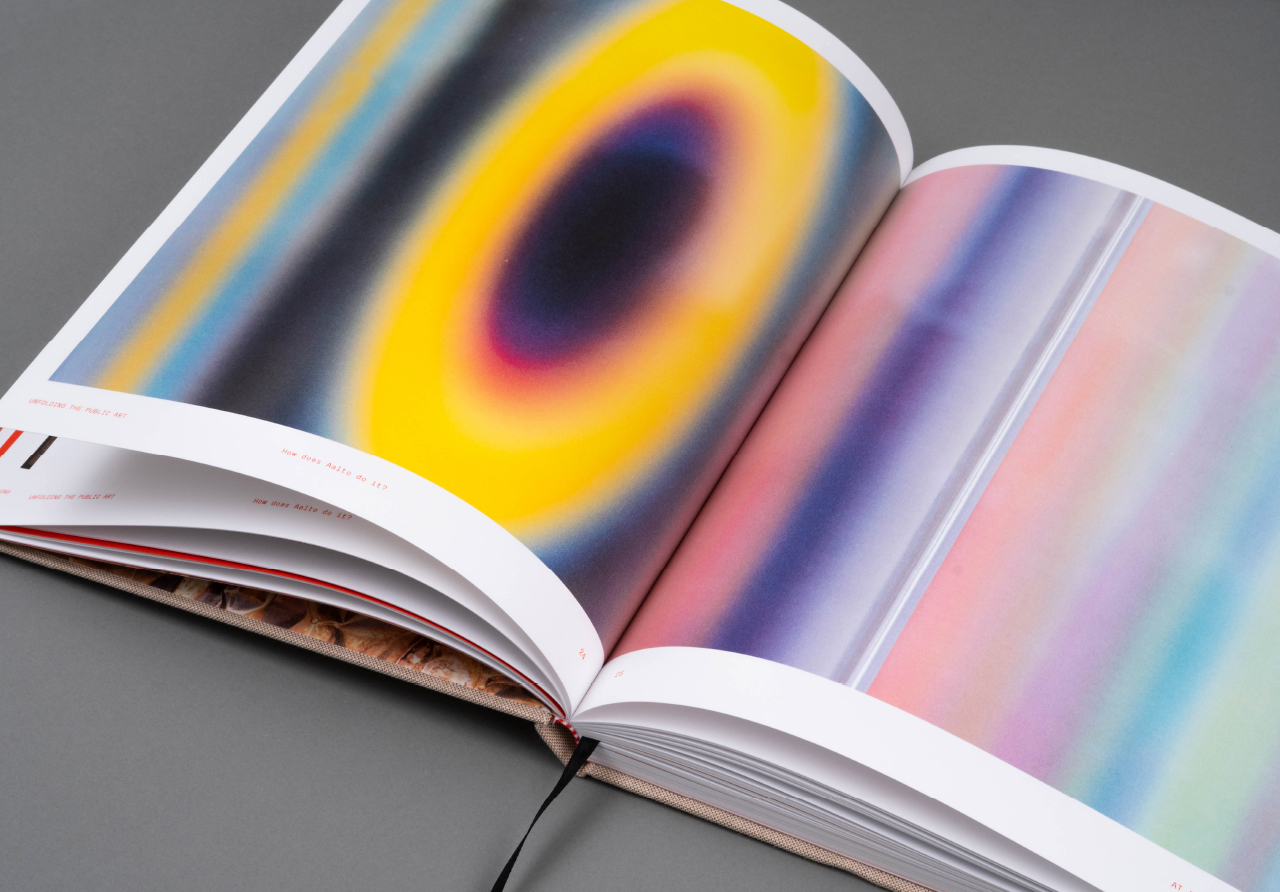
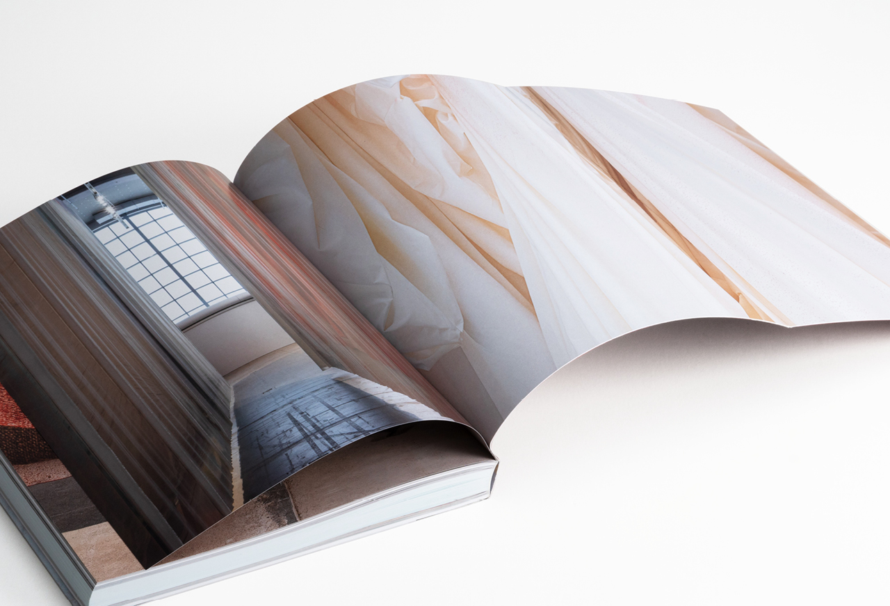
We designed a publication for Aalto University showcasing its collection of public art. The book addresses questions about the role of public art within the context of the university and its impact on teaching, research, and well-being. It opens up the artwork process on multiple levels through articles, photographs, comments by artists and visitors, and figures.
Our goal was to design a sustainable, high-quality, and beautiful object within an international context. Our proposal for the typography of the book was based on fonts used by Aalto’s graphic design graduates – we also wanted to showcase Aalto’s versatile expertise in the field of design. This work has a special meaning for us because we are Aalto alumns.
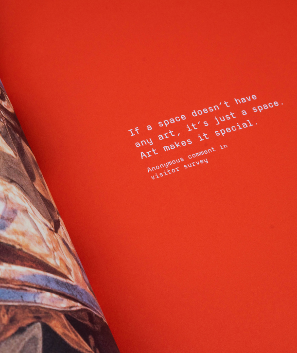
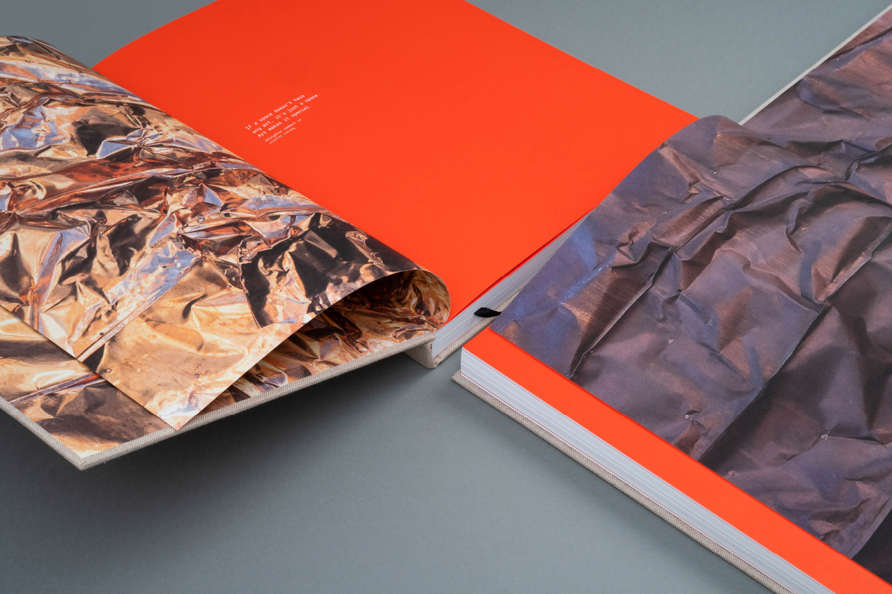
Gloria Lauterback’s work Kreutzstrasse is featured on the flyleaf of the book – before and after the effects of weather.
“Collaboration with Dog Design has been smooth and seamless. The graphic designers’ decades of experience are reflected in the quality and the confidence in which they work. I am very pleased with the visuals of the book and have already received a lot of positive feedback on it. Impressive visual expertise!”
Outi Turpeinen
Doctor of Arts
Director, Public Art & Exhibitions
Editor-in-Chief of the book
to unfold:
spread,
open,
reveal,
open up
All fonts used in the book were designed by former Aalto students.
AT Alfa & AT Normal / Janne Gammelin, Ateljee Gammelin
Haikara / Niklas Ekholm, Helsinki Type Studio
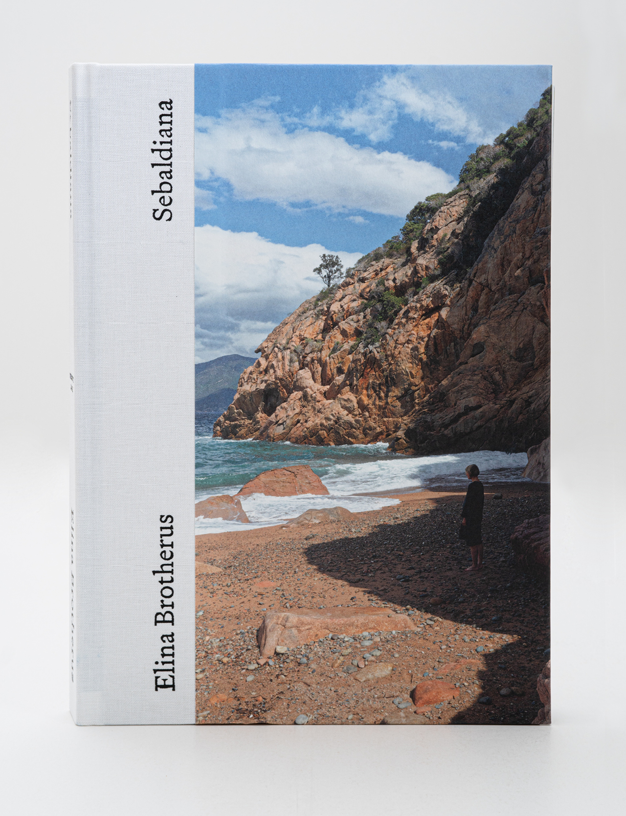
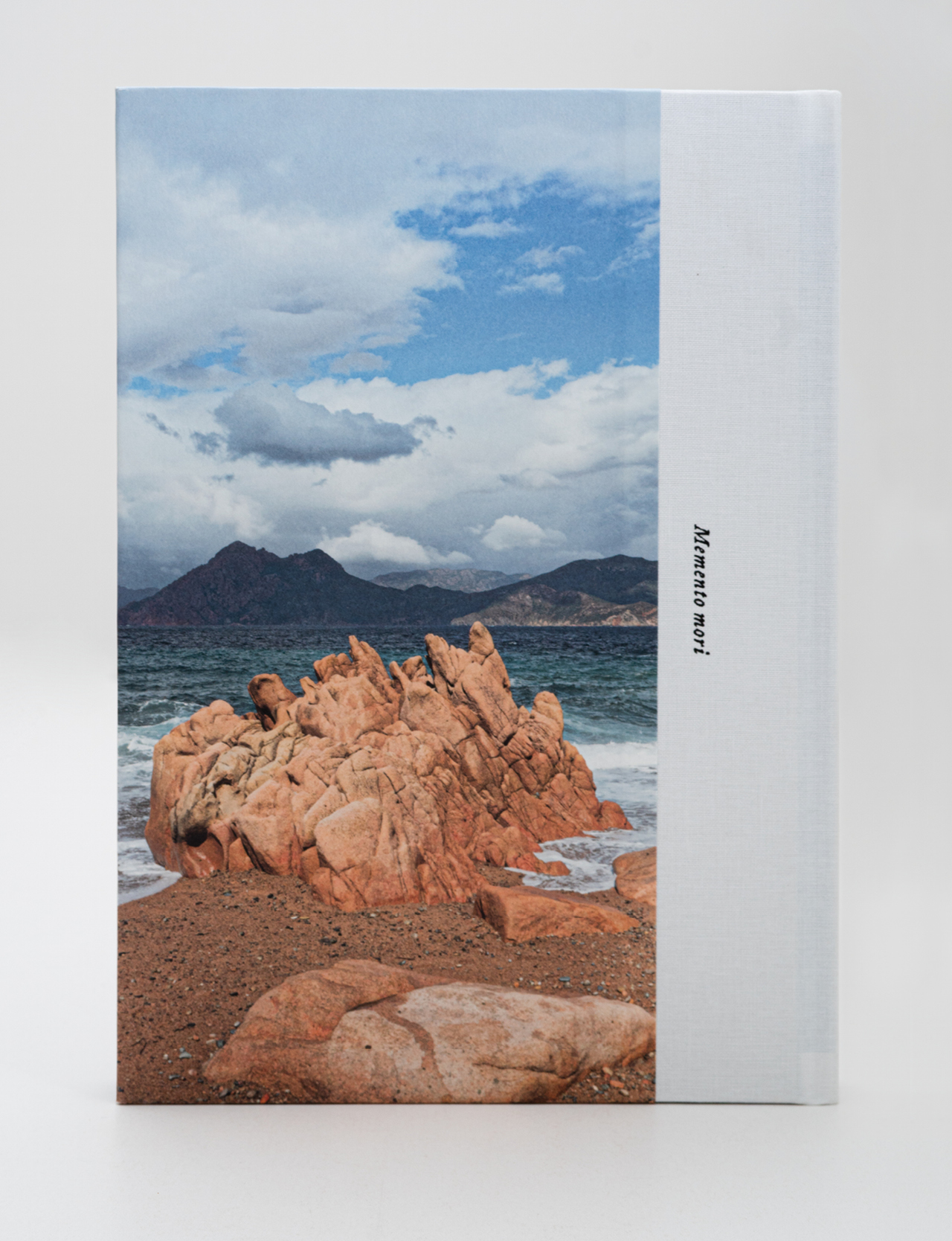
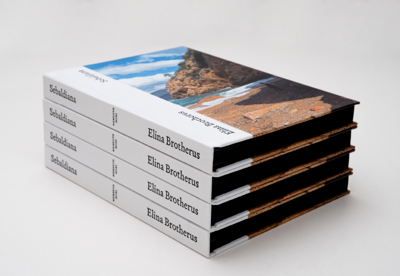
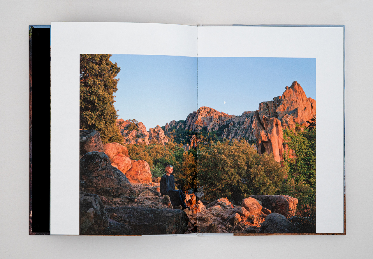
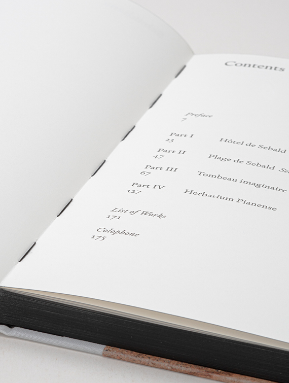
Elina Brotherus
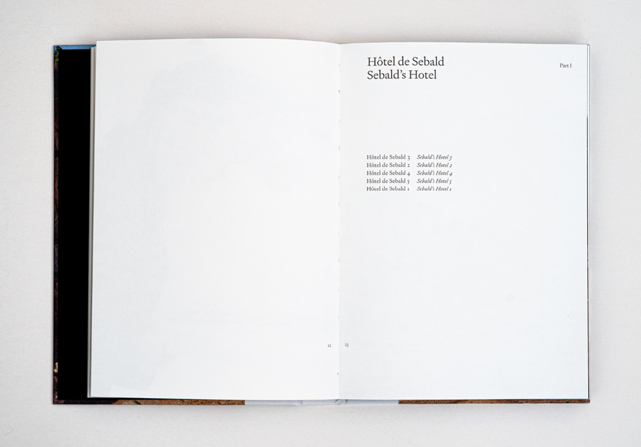
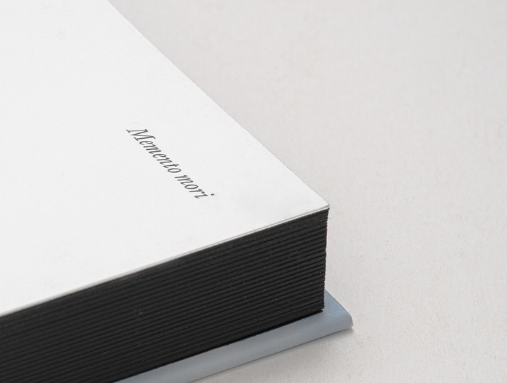
Sebaldiana – Memento mori
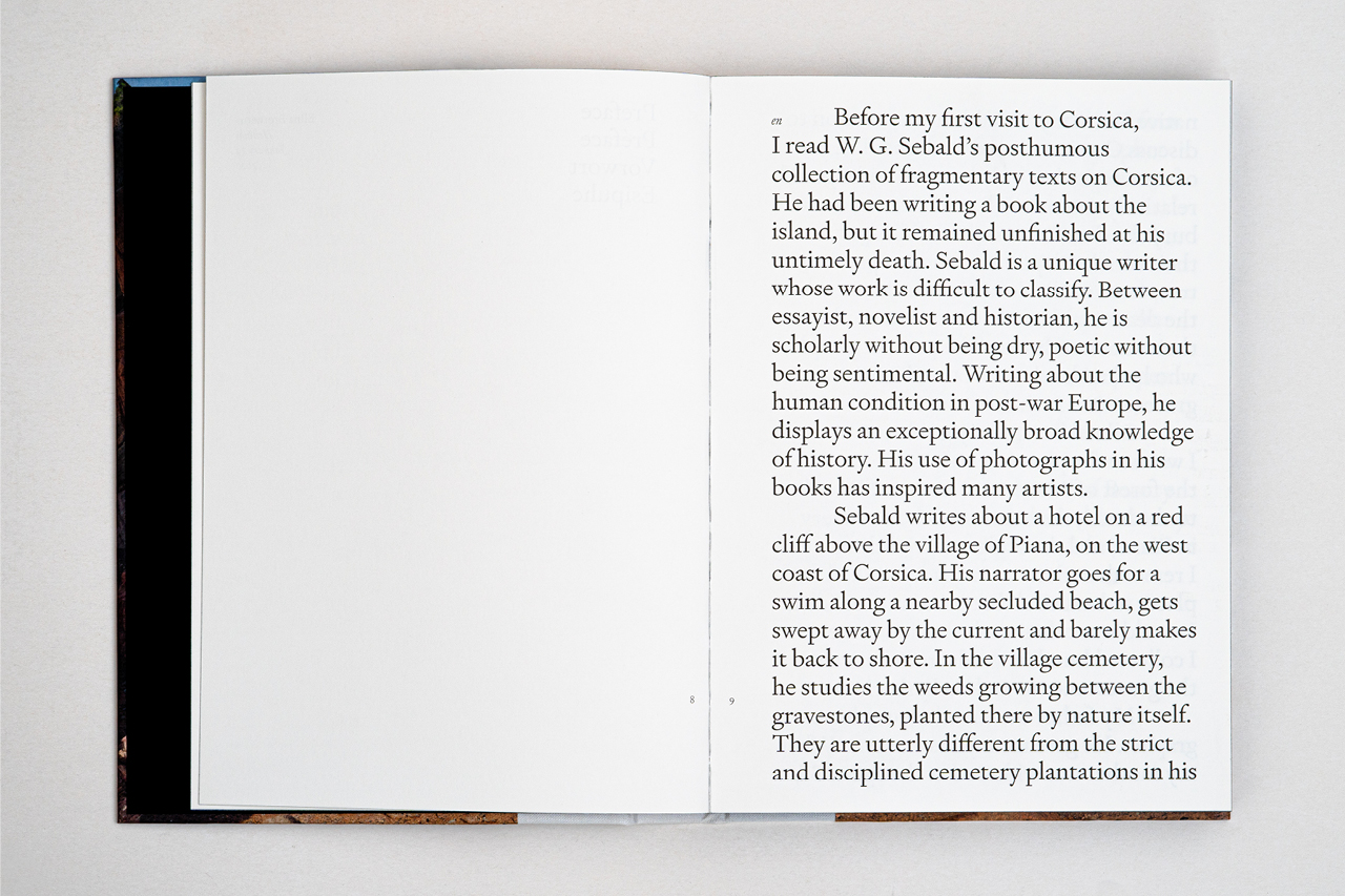
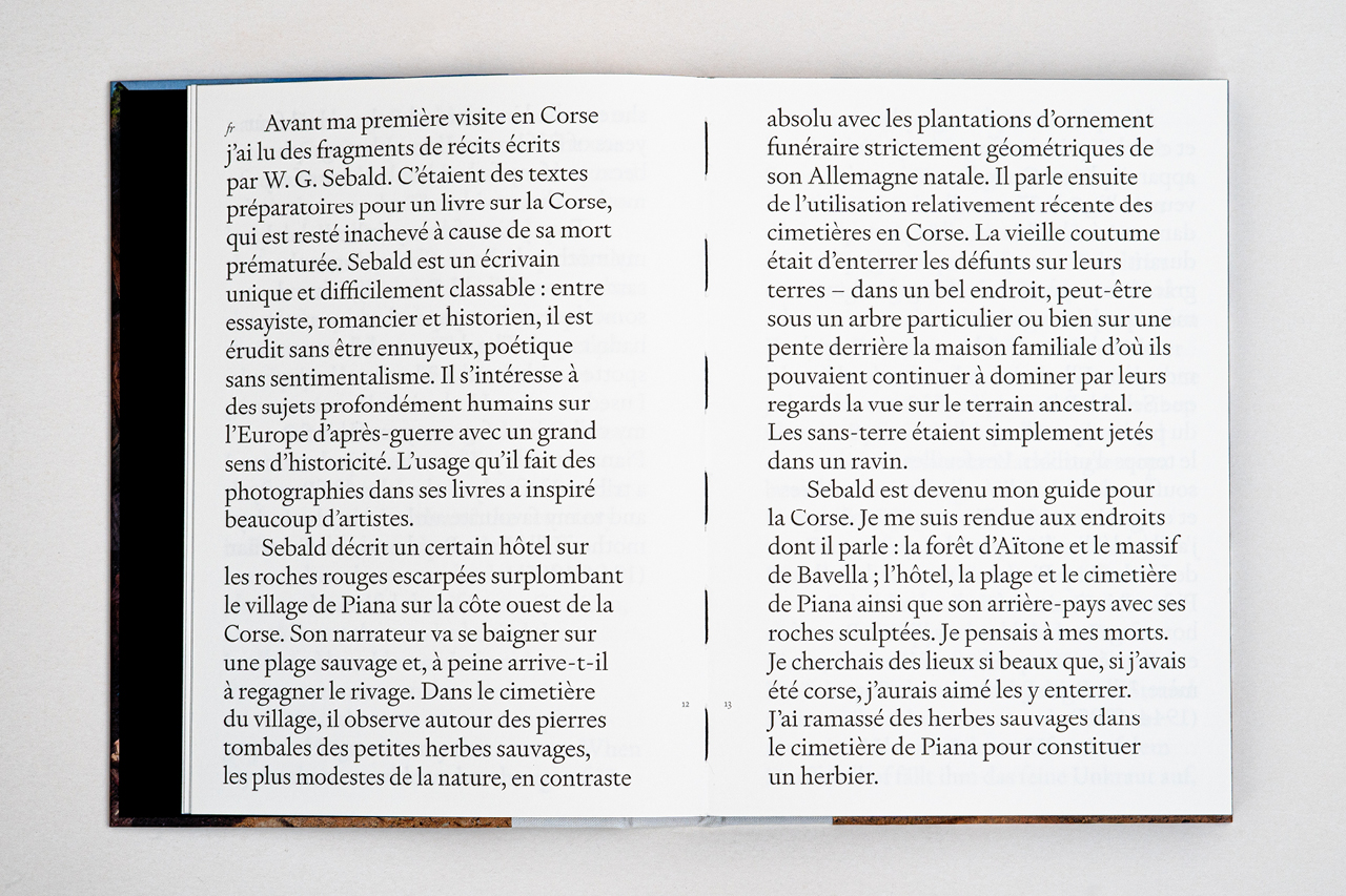
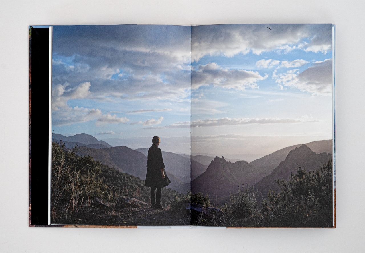
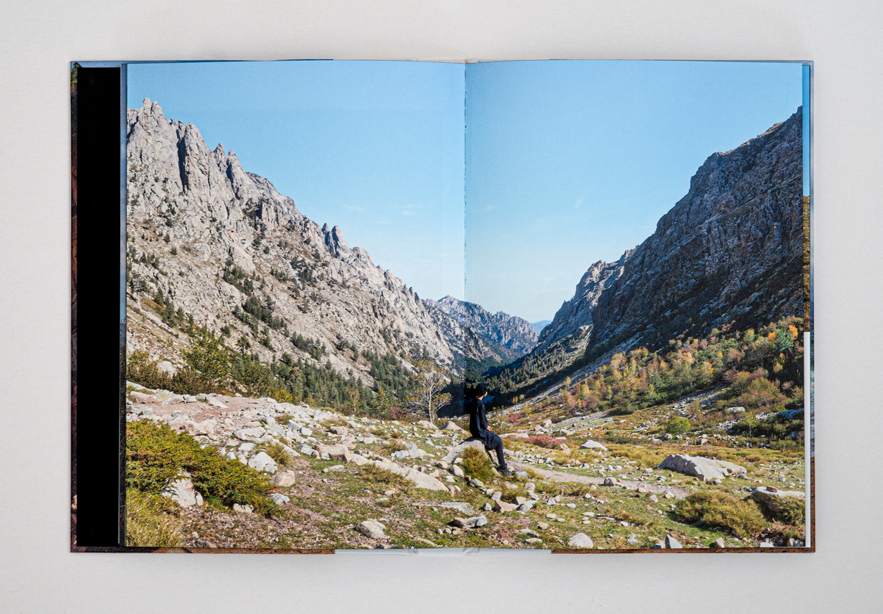
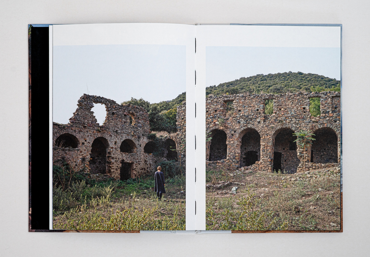
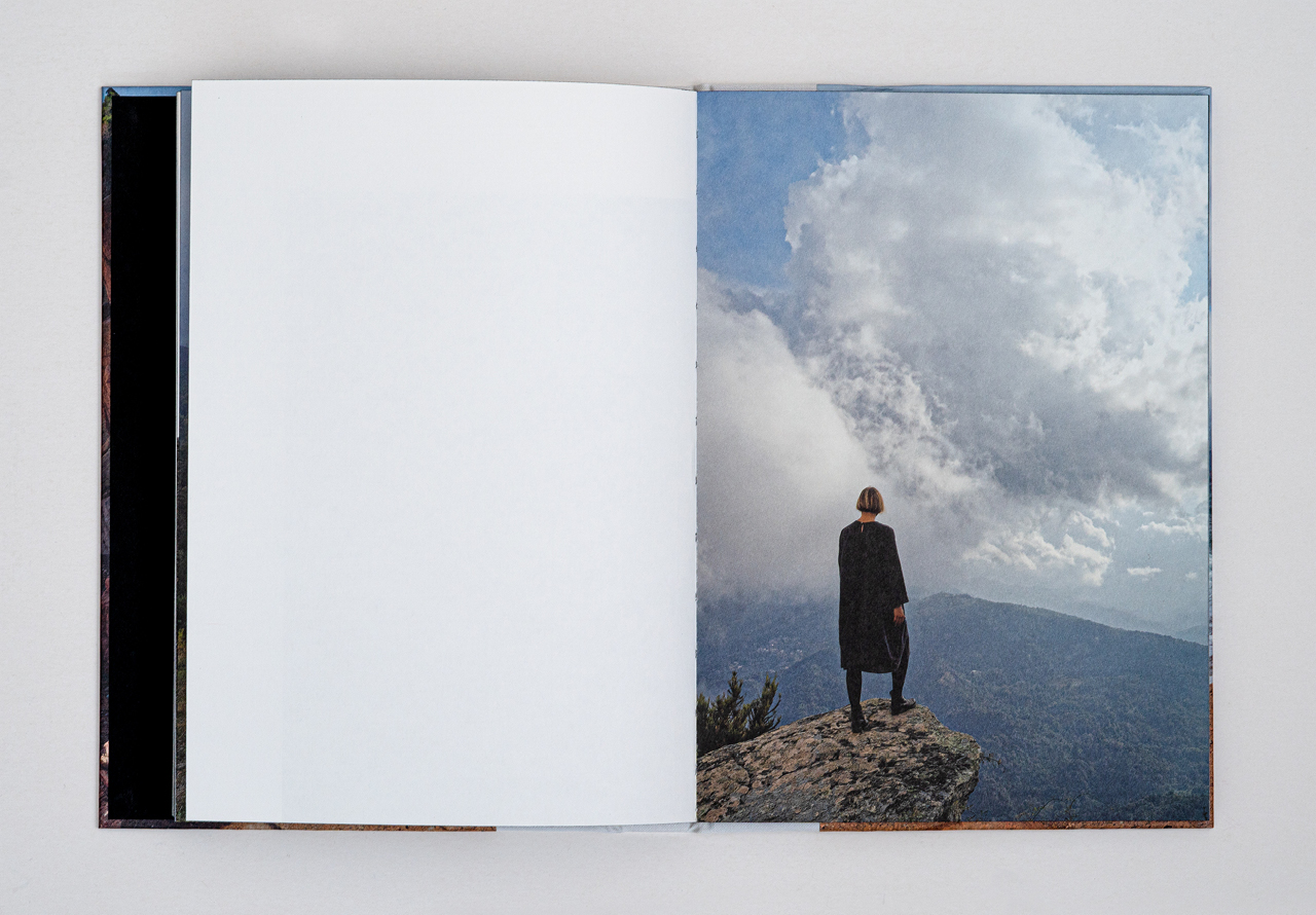
Elina Brotherus’ photo series Sebaldiana: Memento Mori was inspired by the author W. G. Sebald’s texts about Corsica. Sebald’s book Campo Santo served as Brotherus’ guide to Corsica and its ruggedly beautiful nature, as well traditional grave sites in special places such as at the foot of a big tree or on a mountainside. Along the way, Brotherus began looking for places to take pictures which could have served as burial places for her loved ones as well.
Elina Brotherus dedicates her book to her mother, Ulla Brita Brotherus, née Sommar (1944–1985), thanks to whom she became an artist. The book is a tribute not only to her but also to Corsica, the island of beauty.
The book’s binding and format, with its French half-bindings and borderless photos evoke memories of historical novels. The powerful landscape imagery on the cover gives a romantic first impression, but a closer look reveals a woman in black standing in the shadow of the cliffs. What has happened?
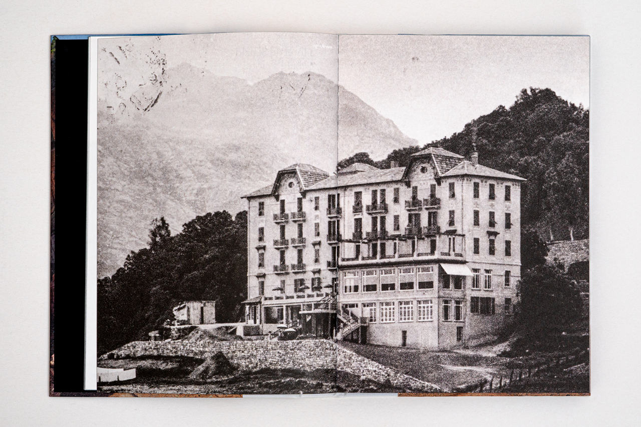
Sebald’s quotes, in four different languages, have been highlighted in the book for study: How different do languages look with their distinctive characters and letters? Also borrowed from Sebald is the use of black and white images between the different sections of the book. Old picture postcards from Corsica weave a thread into the past. However, the focus of this story is Elina Brotherus’ photos of people in empty hotels, monumental landscapes, and potential burial sites. We can stop there.
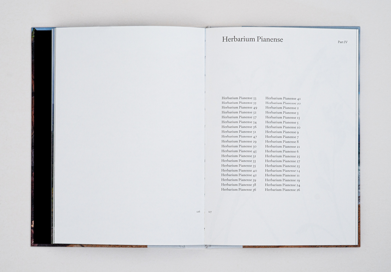
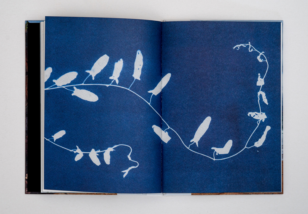
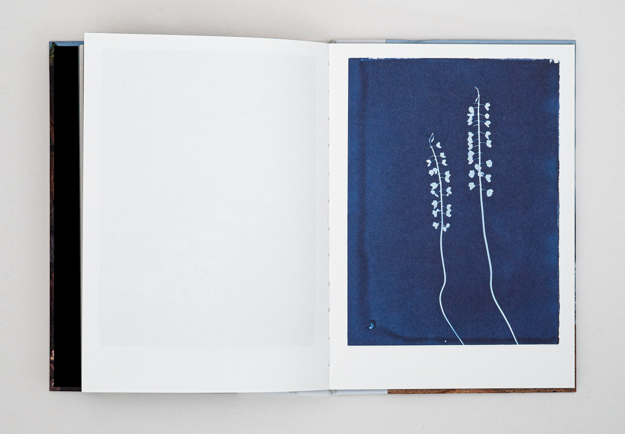
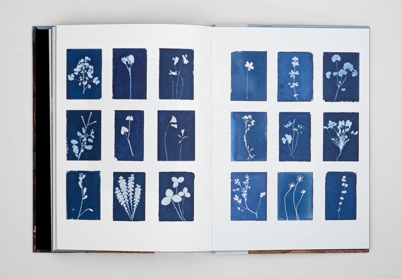
The final part of the book, Herbarium Pianese, contains a series of pictures of natural plants printed on aquarelle paper using a cyanotype process. The paper was found among the possessions of Ulla Brotherus after her death.
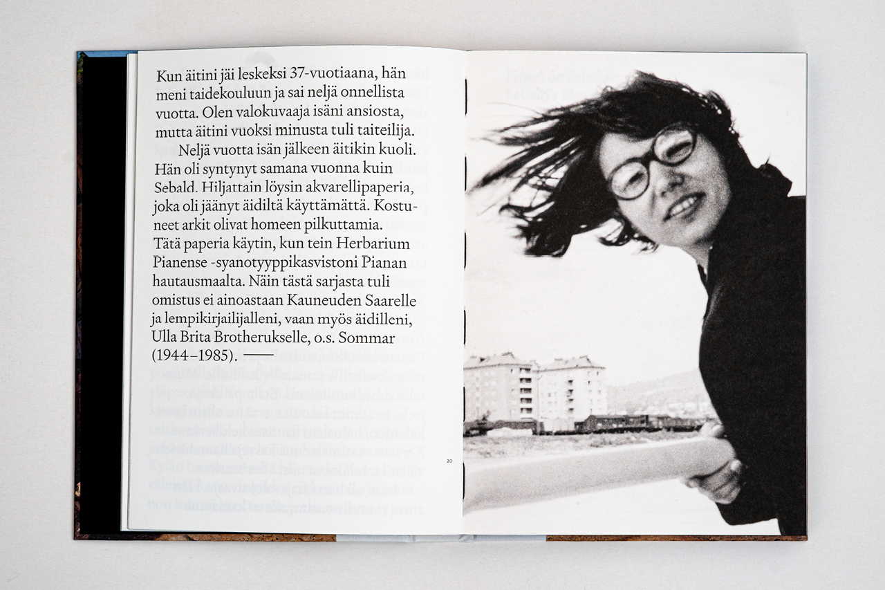
“My father was an amateur photographer. He gave me my first camera. When my mother was widowed at the age of 37, she enrolled in an art school and had four years of fulfillment. I am a photographer because of my father, but because of my mother I became an artist.”
Elina Brotherus
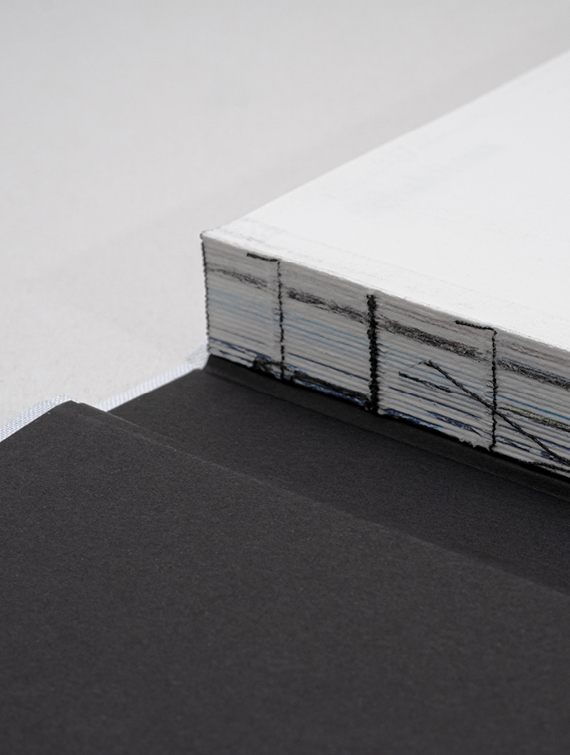
A black edge dye and binding thread complete the ensemble.
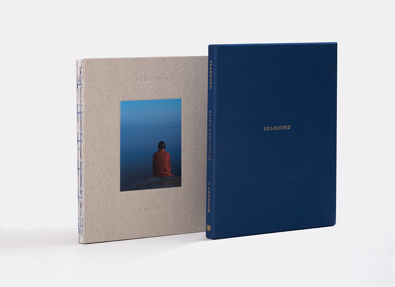
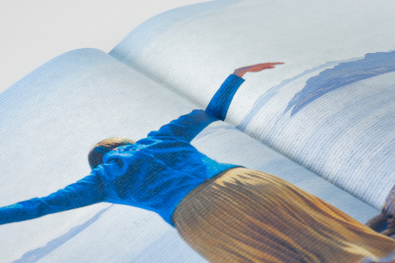
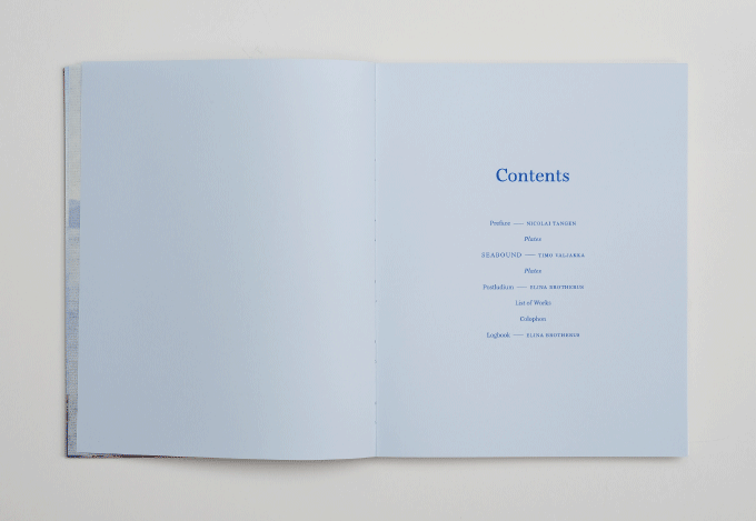
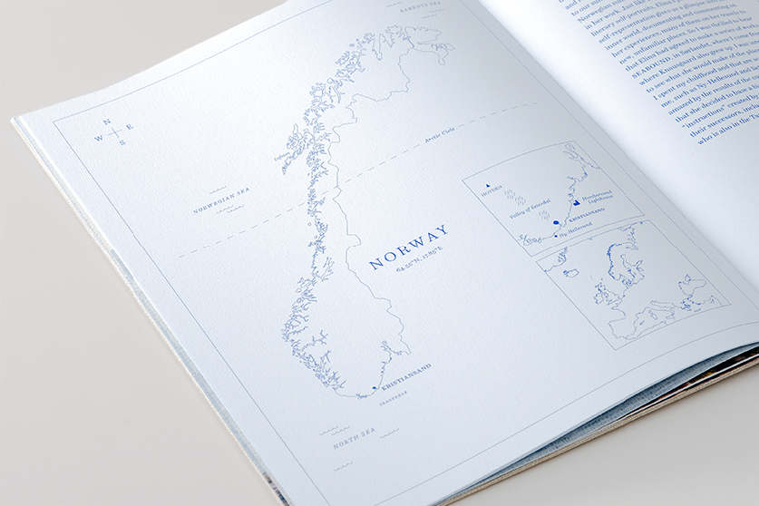
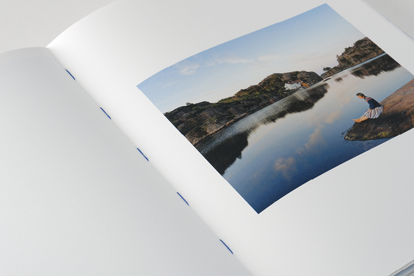
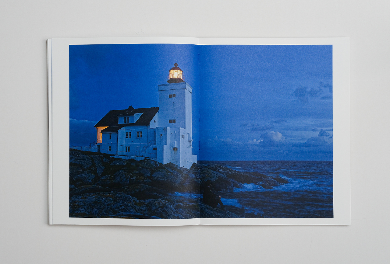
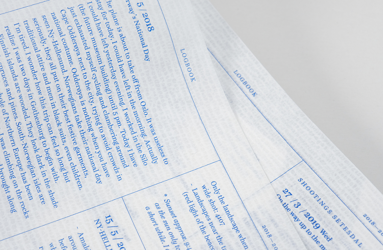
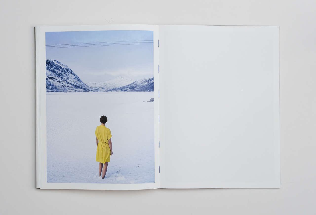
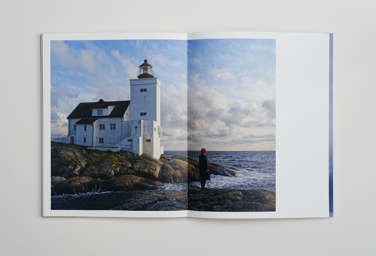
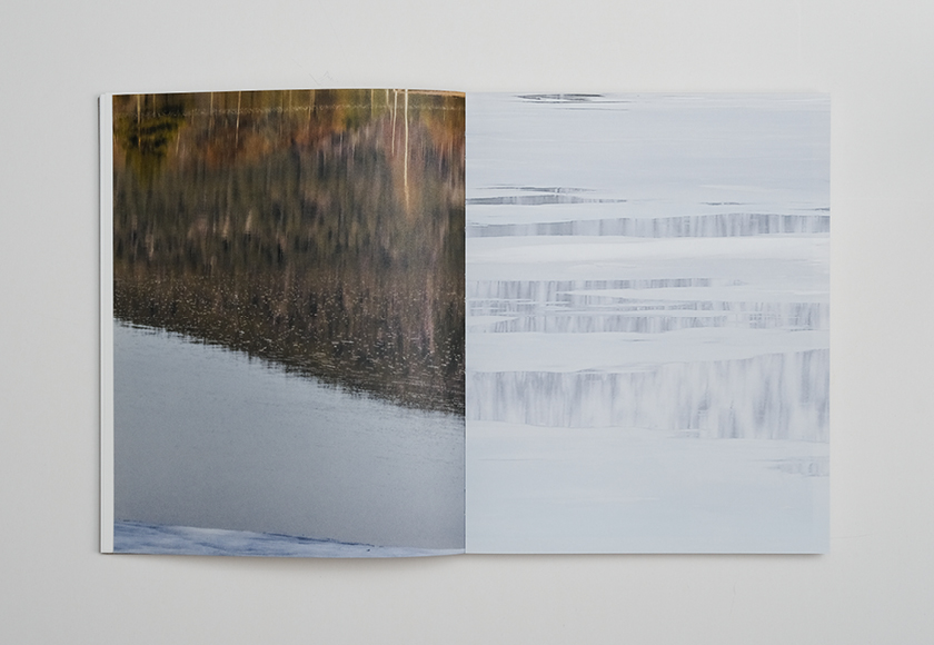
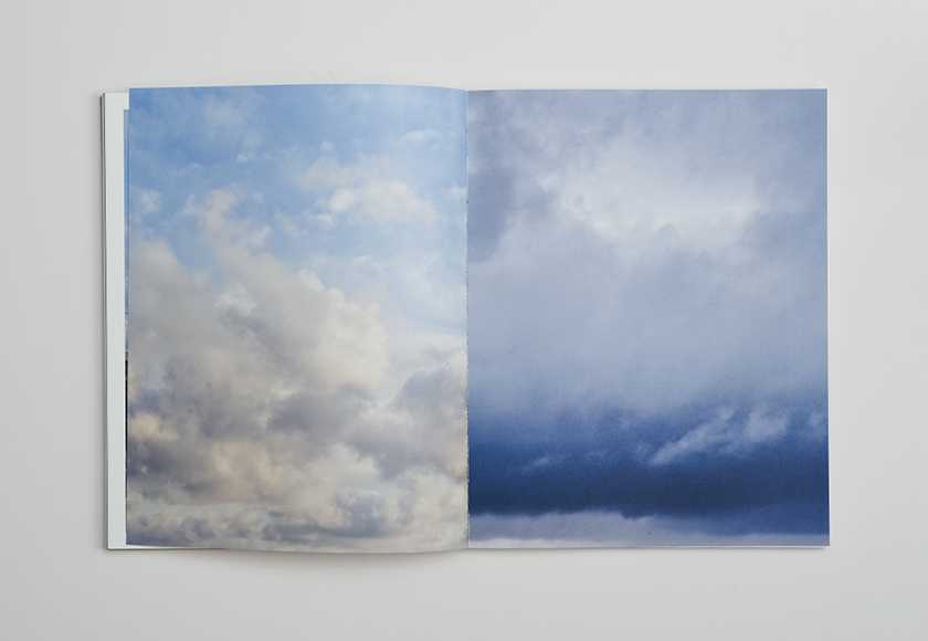
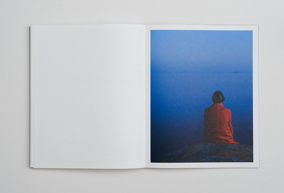
Elina Brotherus: SEABOUND
The AKO Foundation invited artist Elina Brotherus to photograph a series of works on the southern coast of Norway. Brotherus visited the locality of Kristiansand in Sørlandet several times during 2018-2019. “Seabound: a Logbook” was born from these works.
The book stands alongside the photographic series as an independent work in which Brotherus’s stunning pictures, multi-faceted visual narration and typographical elements are joined together like entries in a catalogue-like logbook. The book is published by the well-known German art book publisher Kehrer Verlag.
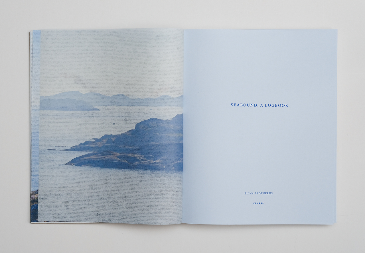
The text pages of the book are printed on light blue paper and both the ink and binding thread are blue.
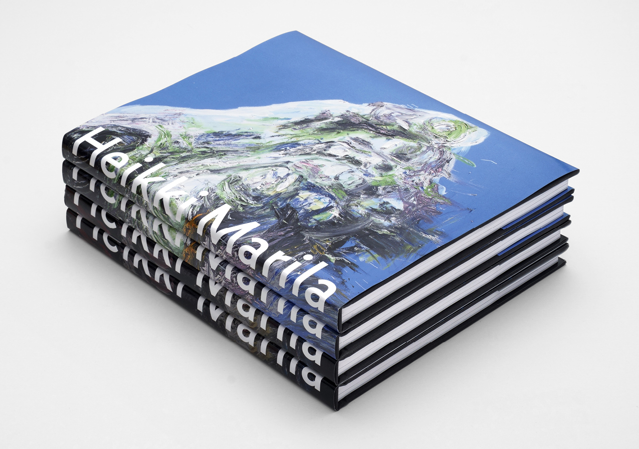
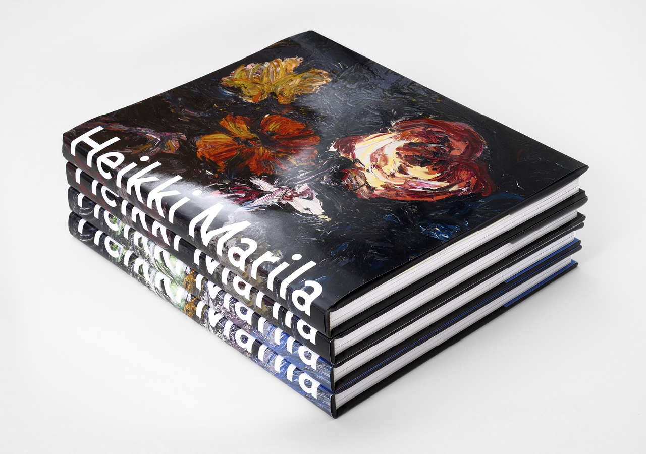
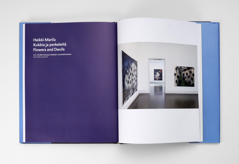
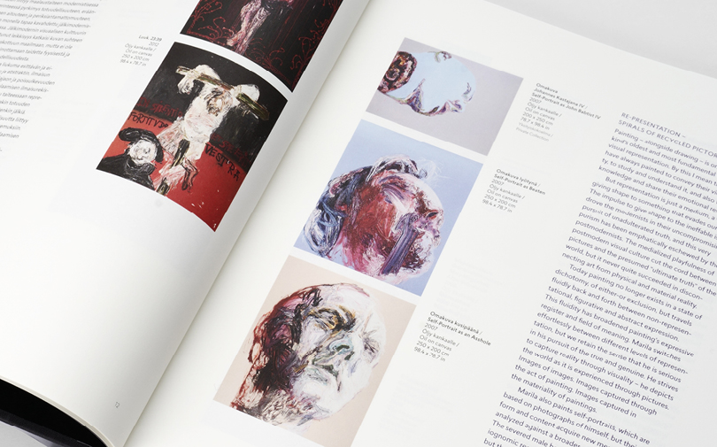
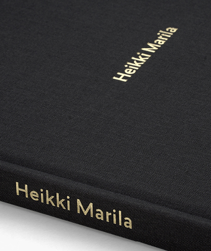
Heikki Marila
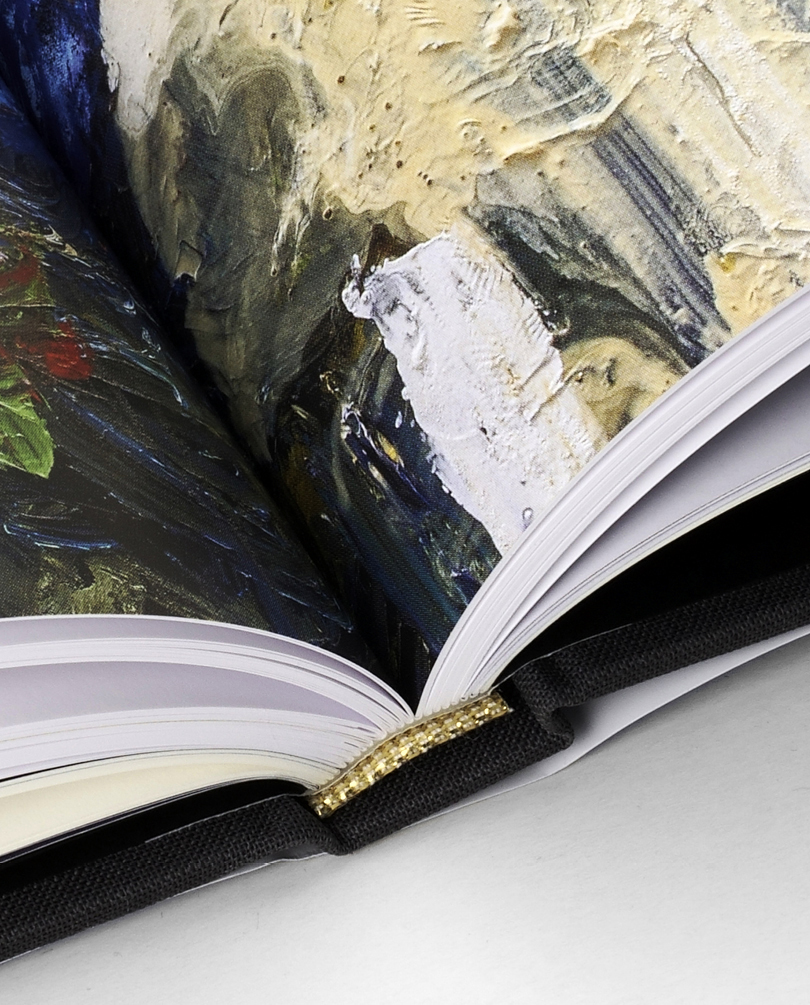
Heikki Marila is a pioneer of the modern expressionist painting tradition in our country and one of our most internationally acclaimed artists. In collaboration with Galerie Forsblom, we have compiled a bilingual art book of his work spanning a period of twenty years. The large format (225 x 320 mm) is suitable for layered, epressive and rather grand paintings. The peaceful layout gives scope to Marila’s powerful works. (The use of) deep royal blue between chapters and sections punctuate the book with a sense of rhythm.
Two versions of the dust cover were printed; Flowers XX for art collectors and The Feet of Christ according to Grünewald II for others.
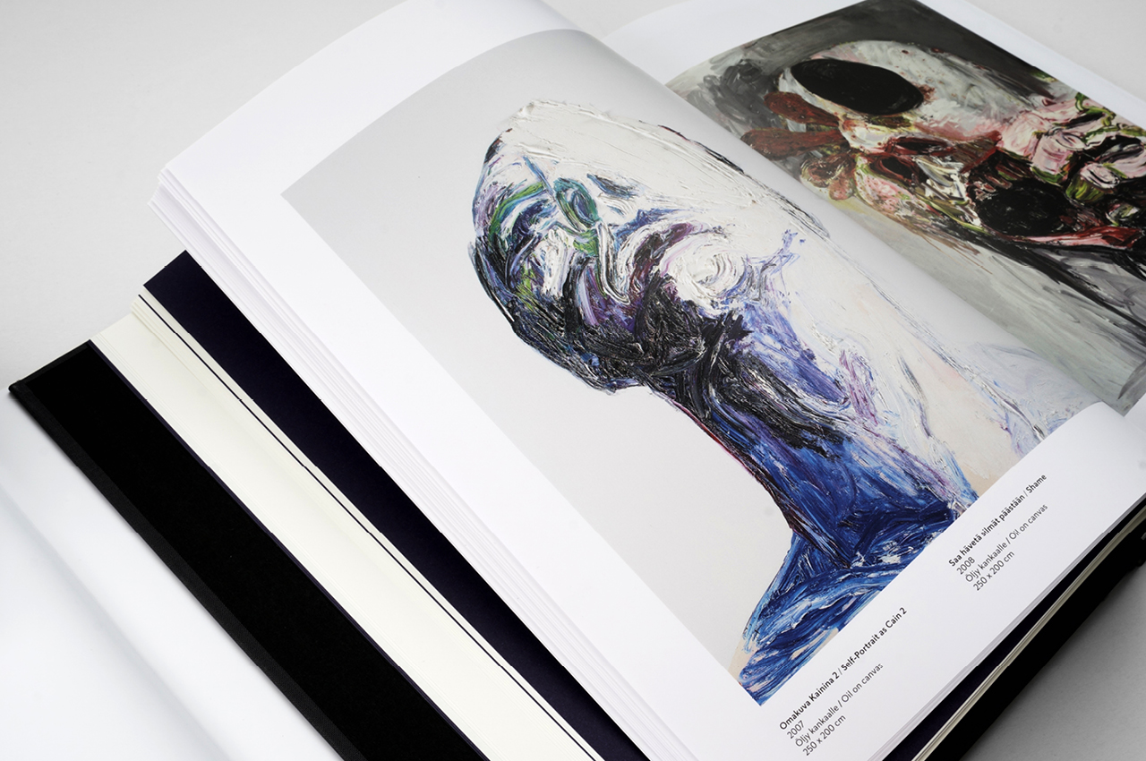
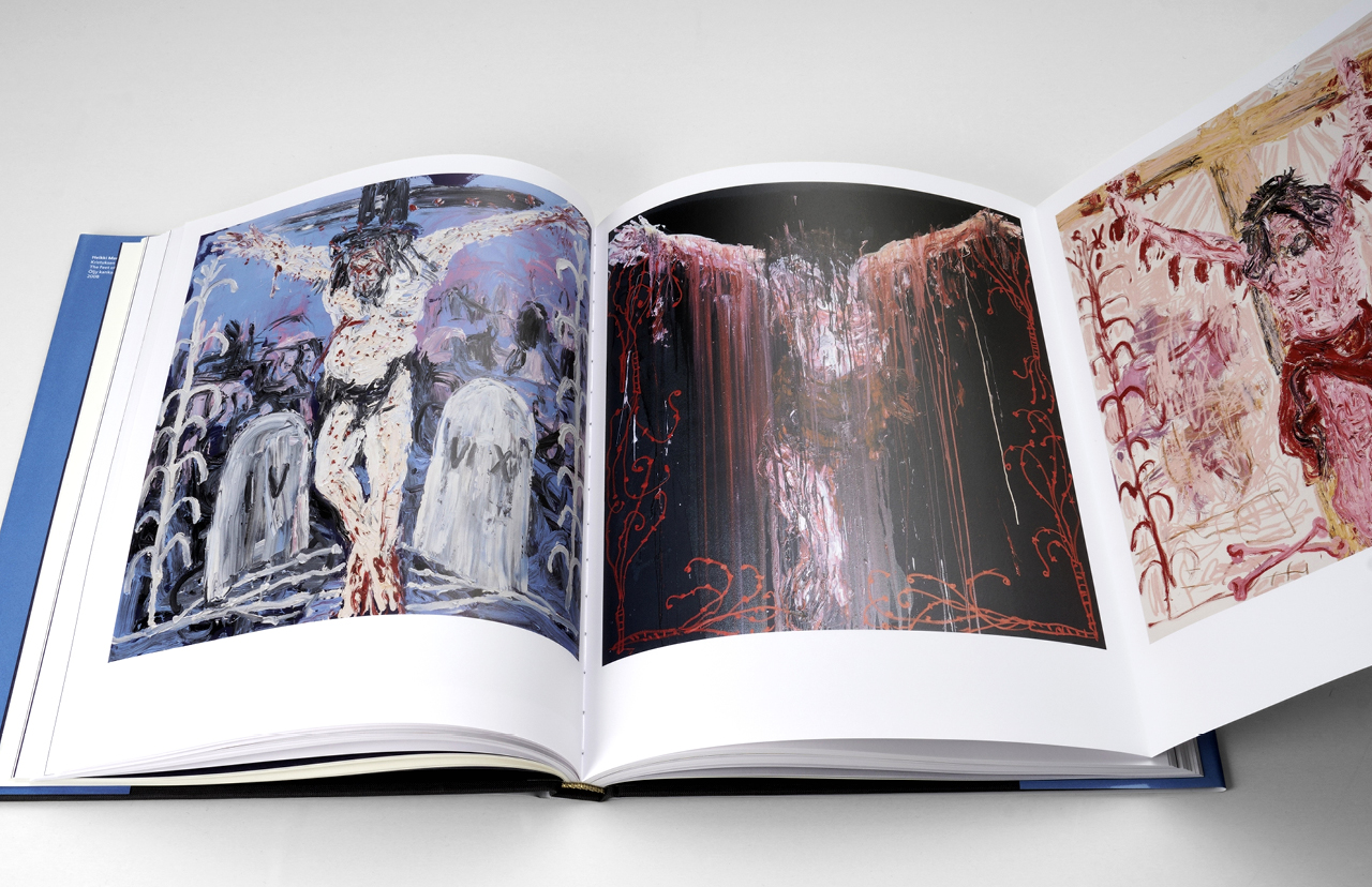
The triptychs are presented in fold-out inserts.
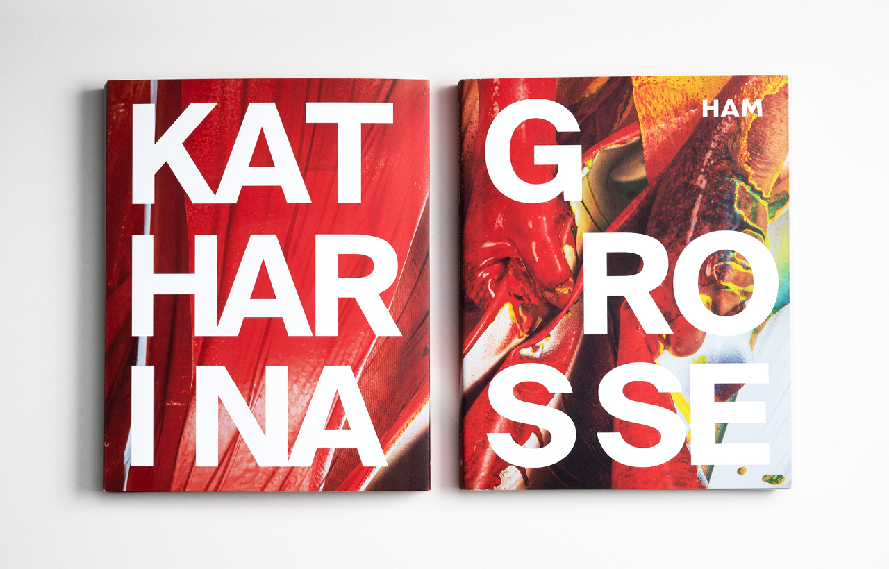
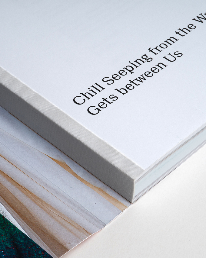
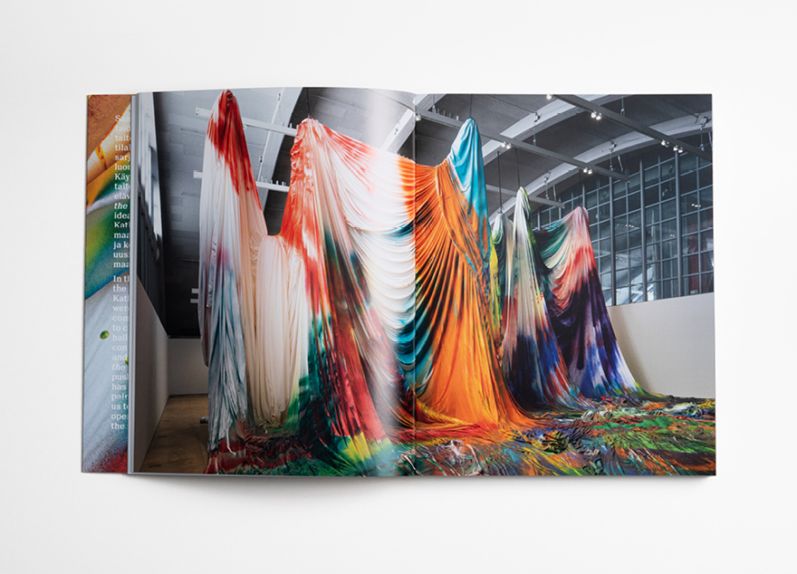
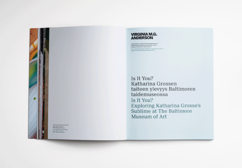
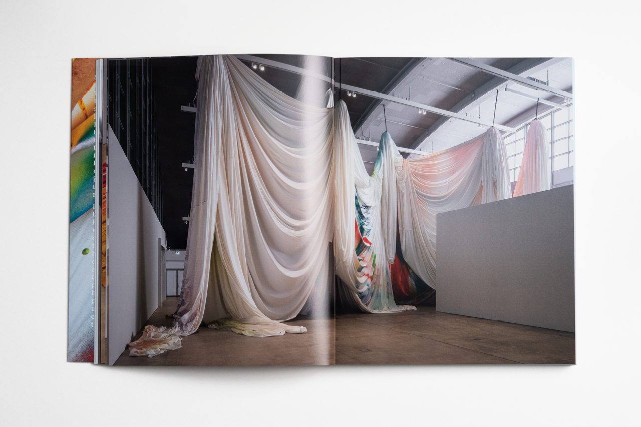
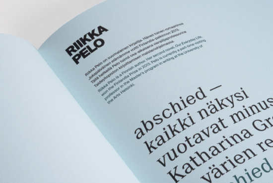
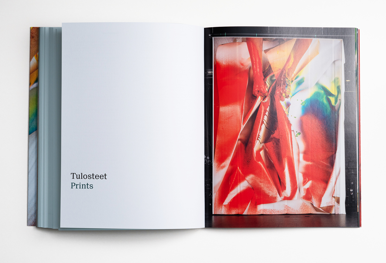
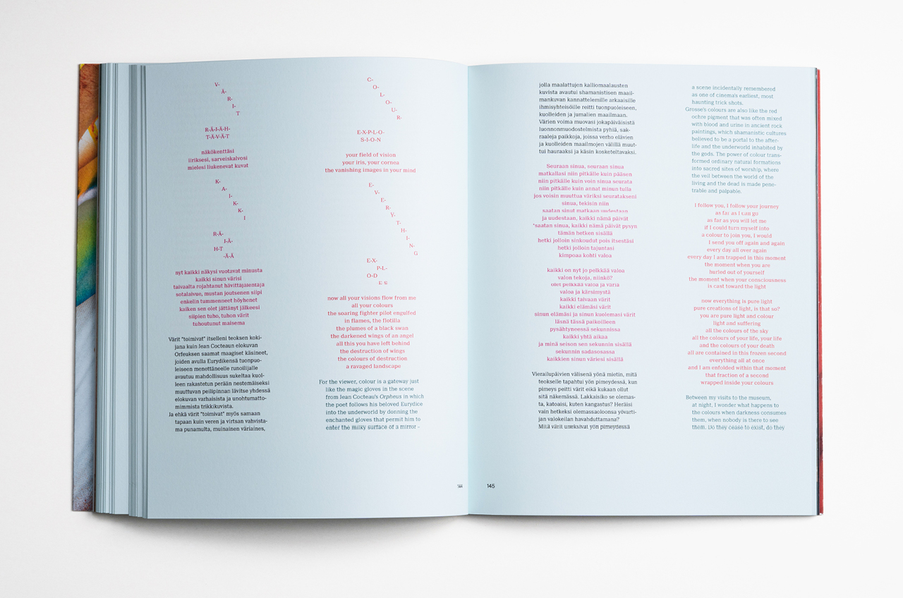
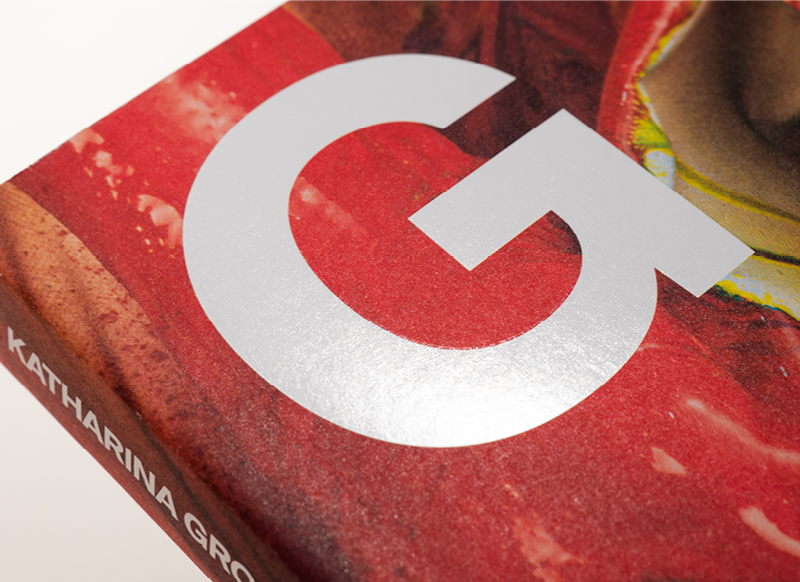
Katharina Grosse
The German artist Katharina Grosse is known for her large-scale spatial paintings, which spread over objects, buildings and even landscapes. Grosse’s works have been exhibited in major art institutions all around the world. Her first solo exhibition in Finland takes over the halls of HAM – the Helsinki Art Museum.
We have designed a catalogue which presents two works extensively featured in the exhibition, as well as highlights from Grosse’s earlier works. The catalogue was designed in close cooperation and dialogue with the artist. High-quality imagery and color reproduction were paramount. We wanted to create a grid and typography that utilises architectural space and composition as a backdrop for Grosse’s colourful and rich works.
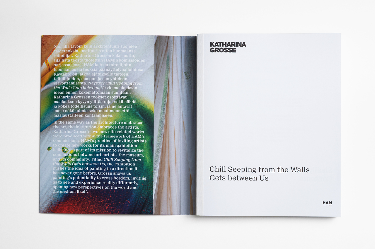
“The book features a Swiss binding, thanks to which it opens beautifully.”
“Throughout our project, I was very grateful to be able to work with such a creative professional as Ilona Ilottu. The numerous schedule changes, multiple text revisions, demanding image manipulation processes, and the strong vision of the different parties made our book project challenging in a positive way. Ilona’s professional attitude, the defense of her own creativity and just the right amount of flexibility contributed to a glorious and wonderful result”.
Sanna Tuulikangas, Intern HAM
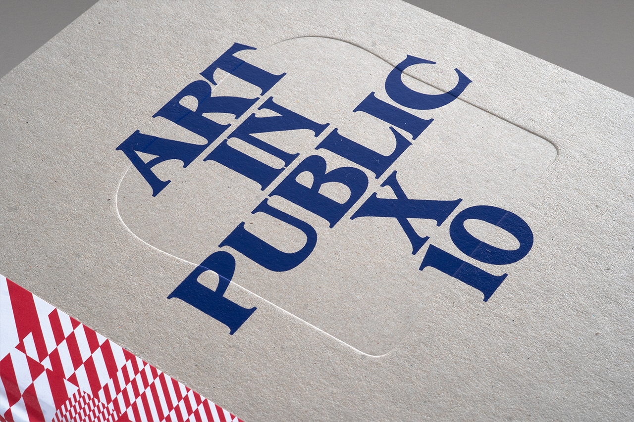
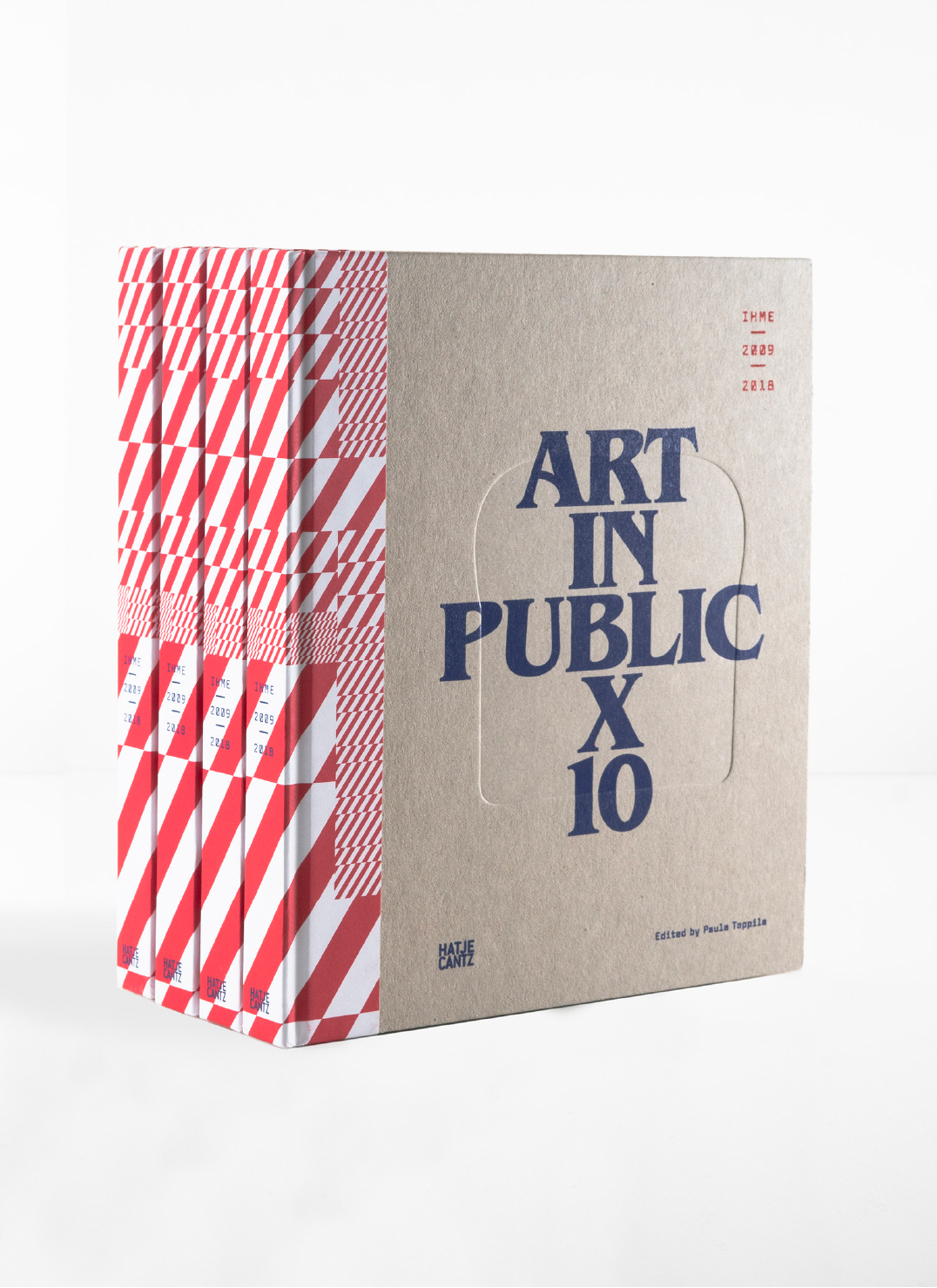
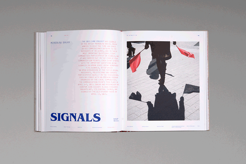
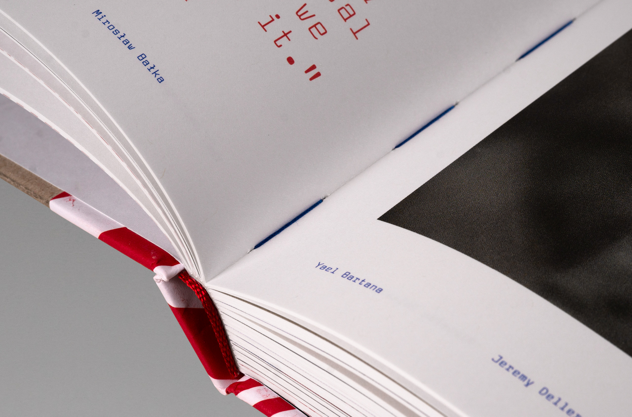
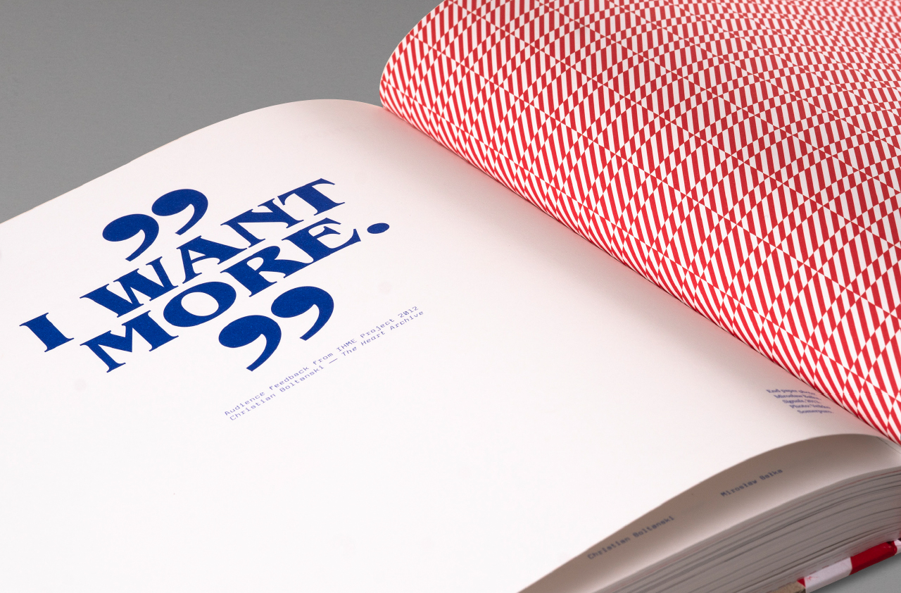
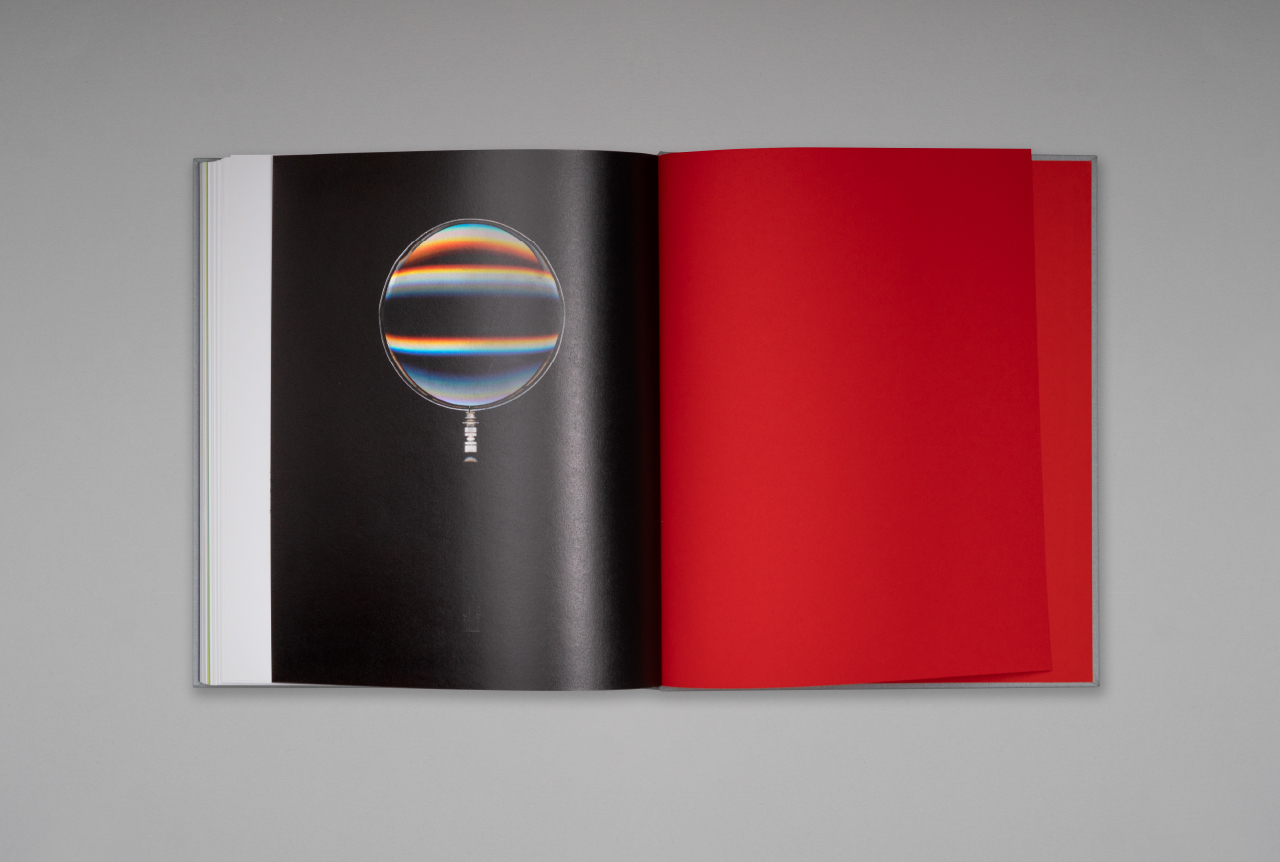
IHME 2009–2018
ART IN PUBLIC X 10
IHME 2009–2018: Art In Public X 10 commemorates ten years of the IHME Contemporary Art Festival, bringing together ten different artworks in public space. The works are typically participatory and site-specific, a momentary presence in people’s everyday lives. The book’s layout crisply applies IHME’s blue-and-red identity and its signature typography. The volume’s prestigious German publisher, Hatje Cantz, is famous for its art books.
“Ilona Ilottu, who took charge of the graphic design, made some brilliant suggestions, for instance, on how the main form and content of the artworks and the key role played in them by the public are communicated simply by browsing through the book. The same multi-layeredness is beautifully present in the book as in the artworks. It was a joy to work with a skilled, professional agency that is adept at conveying a visual sense of place and project management.”
Paula Toppila, Executive Director, IHME Helsinki
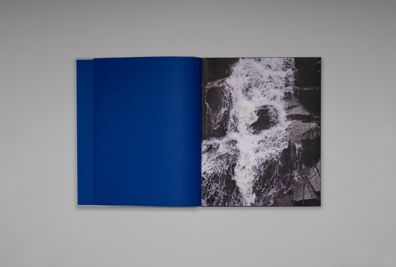
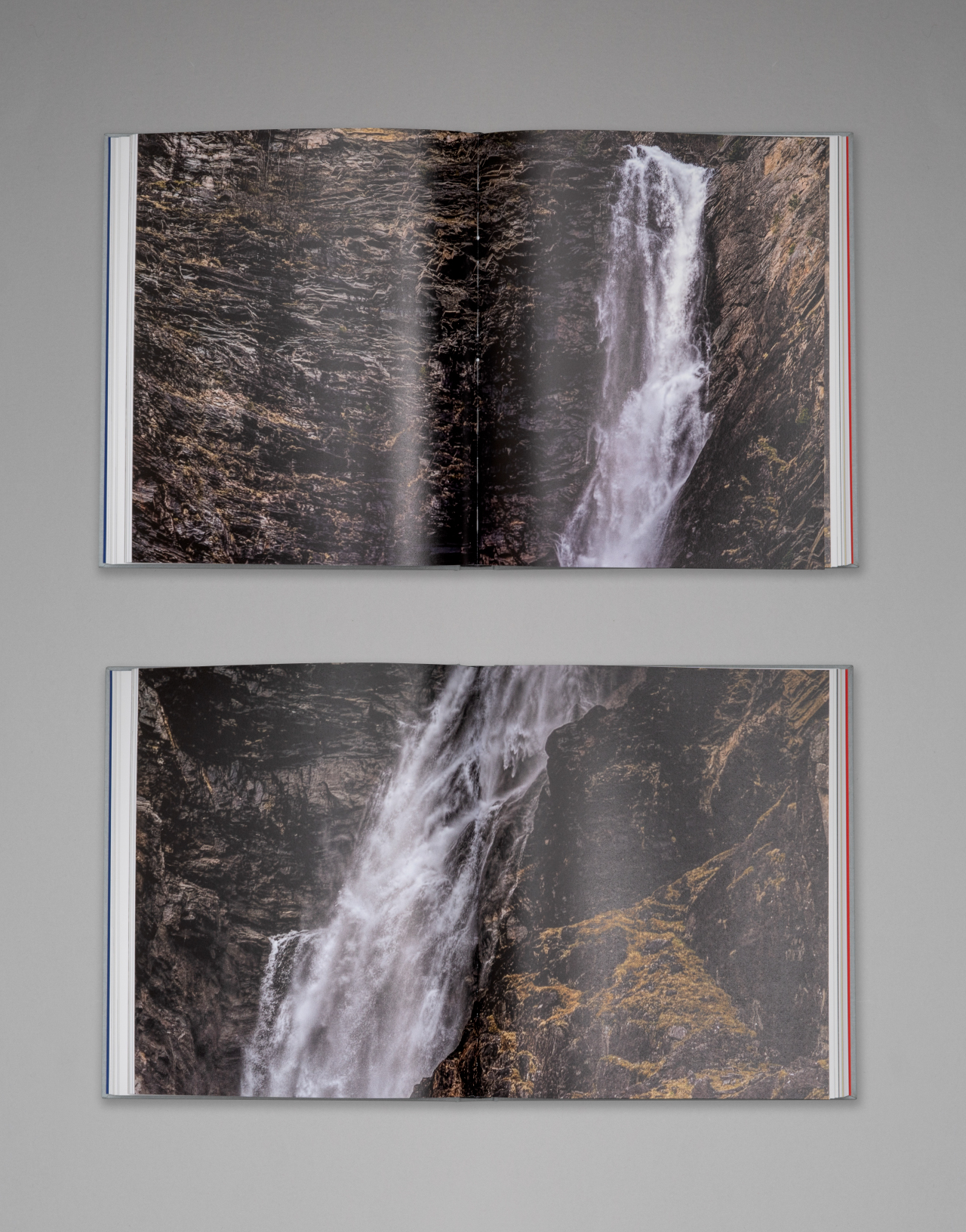
Marko Vuokola
This volume with its timeless form speaks of its subject in carefully chosen words and images. Instead of a chronological presentation, the various themes and pictorial threads dictate its structure.
Finnish Book Art Most Beautiful Book of the Year Prize 2018
Antalis special prize, Vuoden Huiput 2018
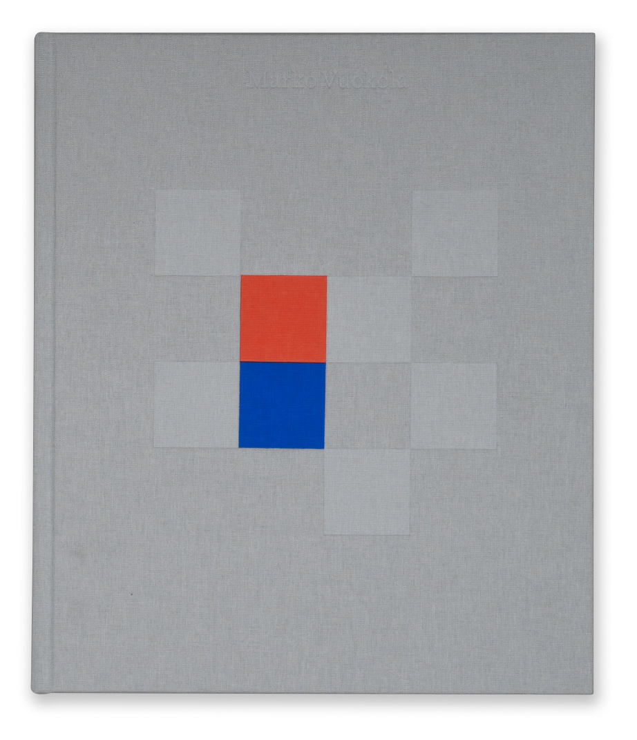
“…There is nothing superfluous in this meticulously designed book, form and content are one.”
Finnish Book Art Most Beautiful Book of the Year Prize 2018 / excerpt from judges’ statement
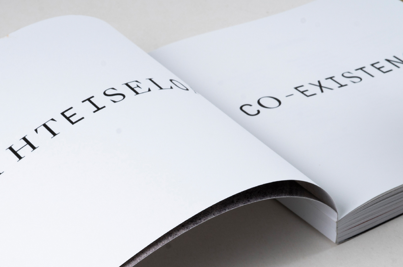
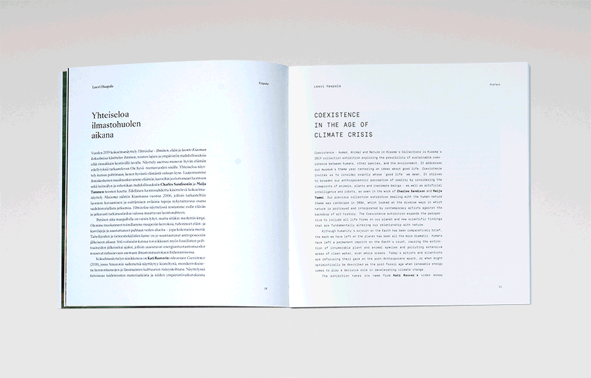
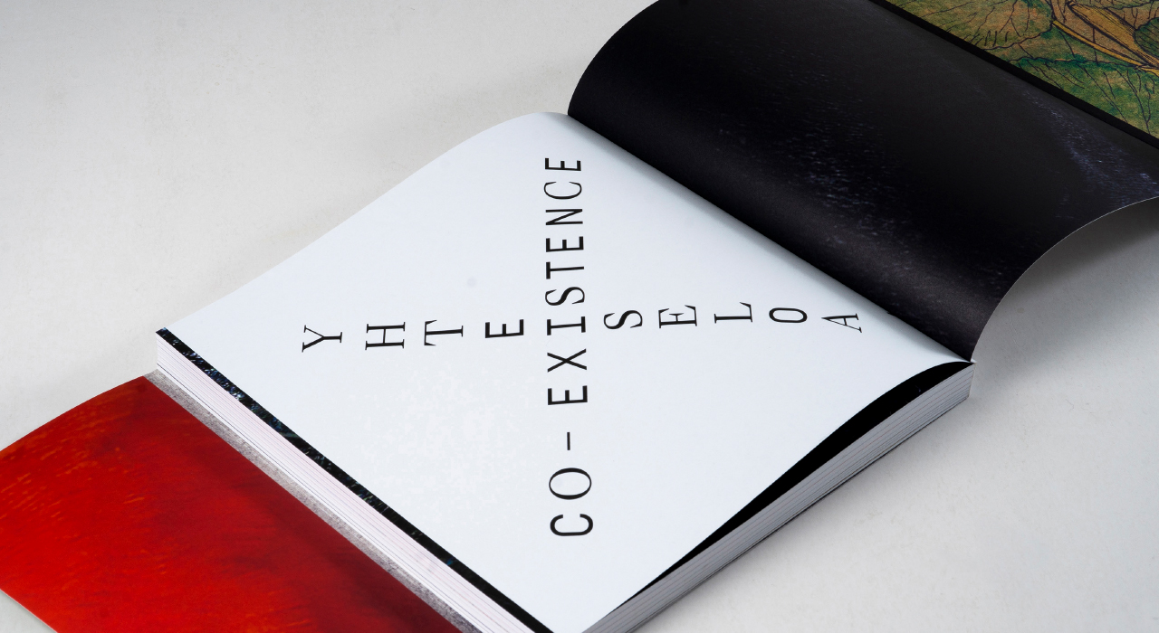
Yhteiseloa / Co-Existence
Museum of Contemporary Art Kiasma’s Yhteiseloa / Co-Existence exhibition considers the options for humans, other species and the environment to live sustainably side by side. The catalogue’s design, for instance, the merging of two types of font, makes a subtle statement on behalf of this mutuality.
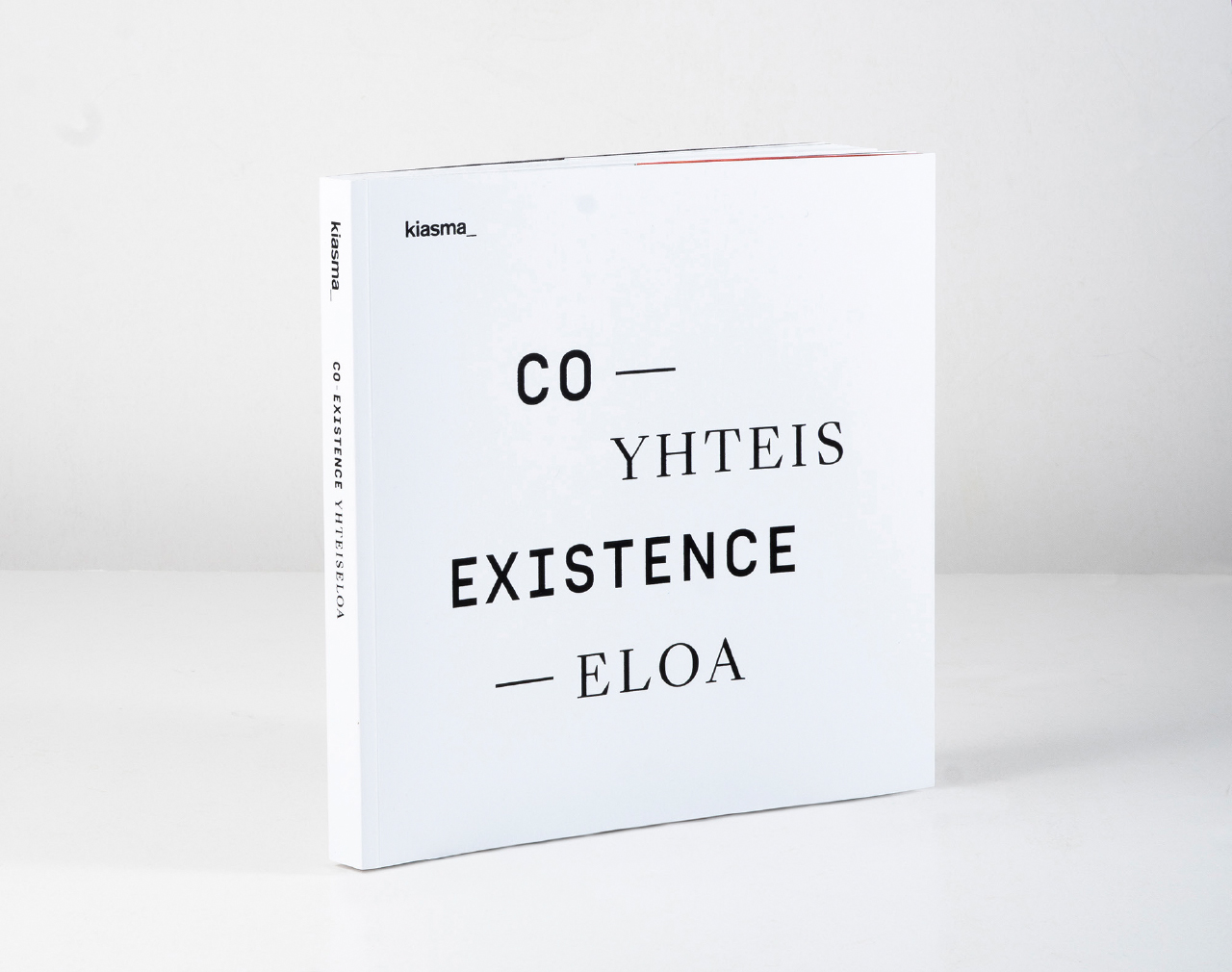
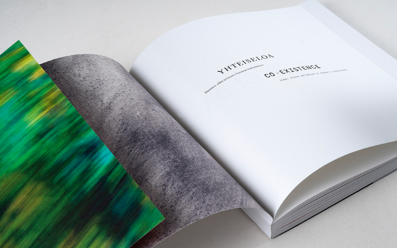
This is the first time that Kiasma’s standard collection format has been given soft covers.
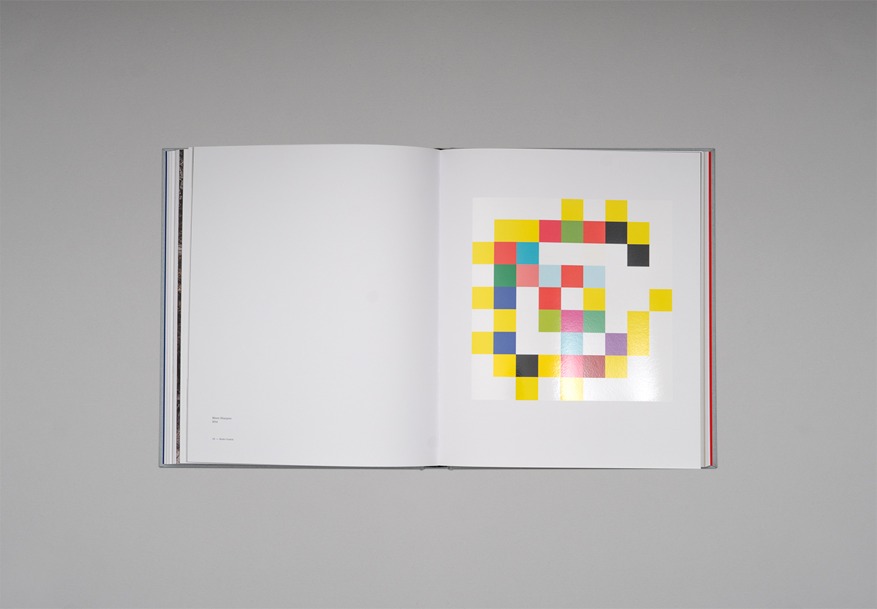
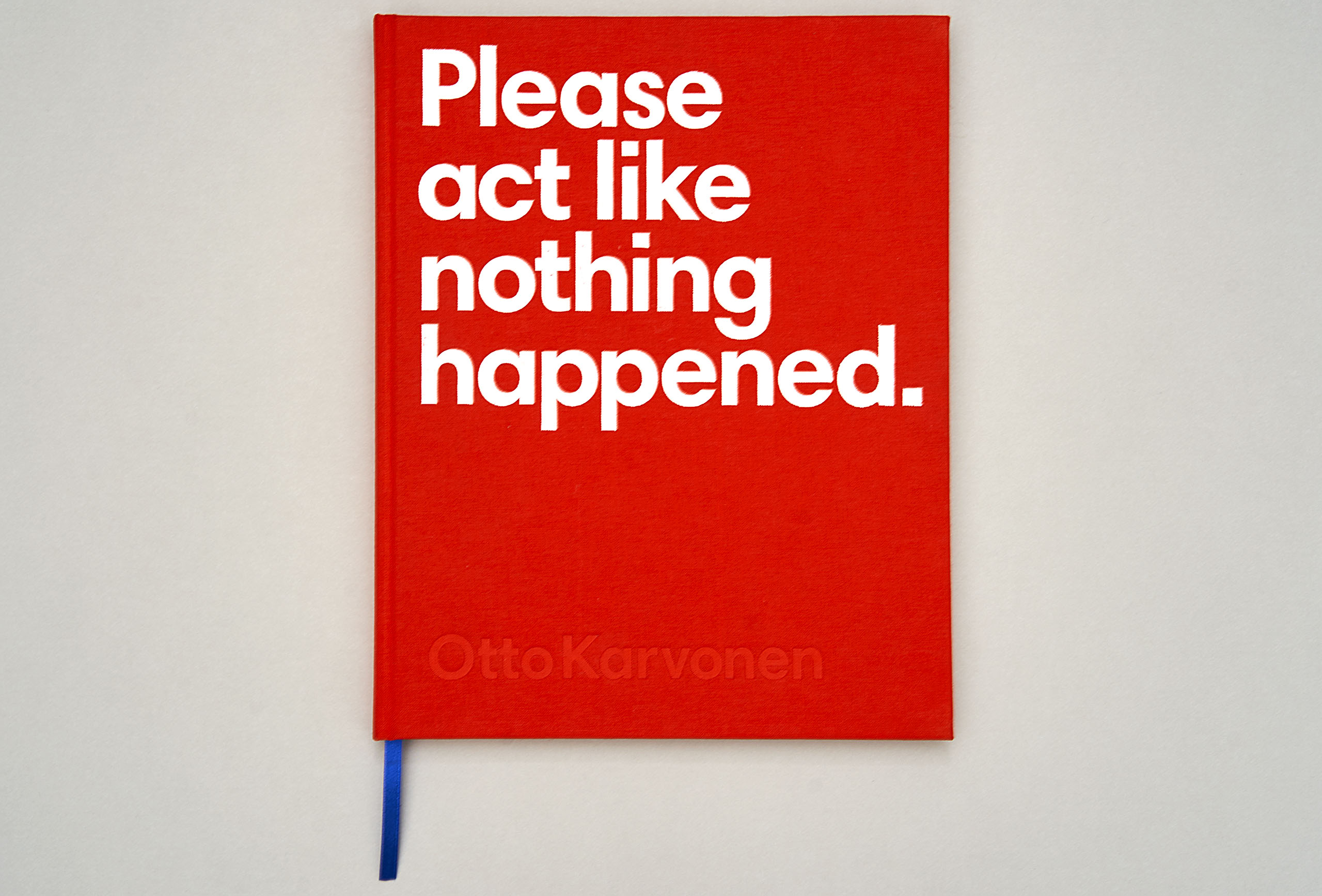
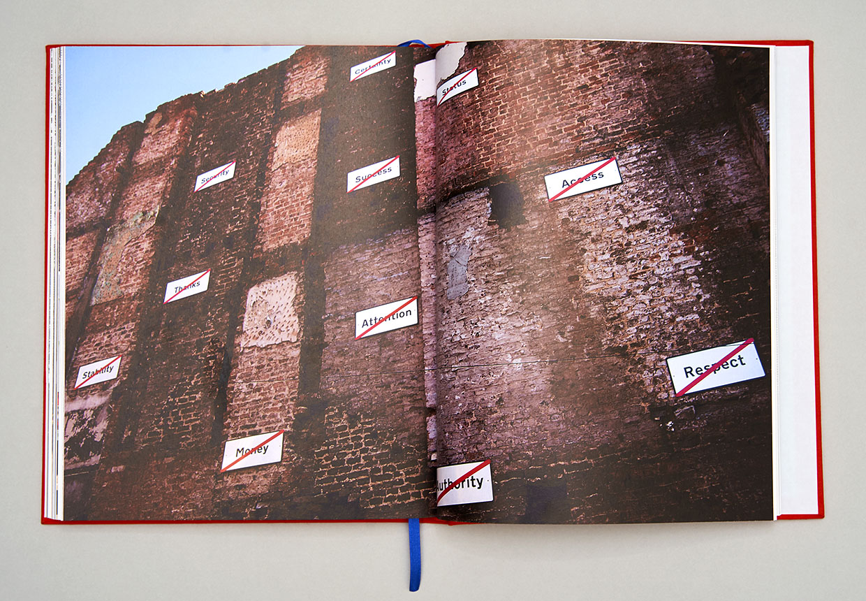
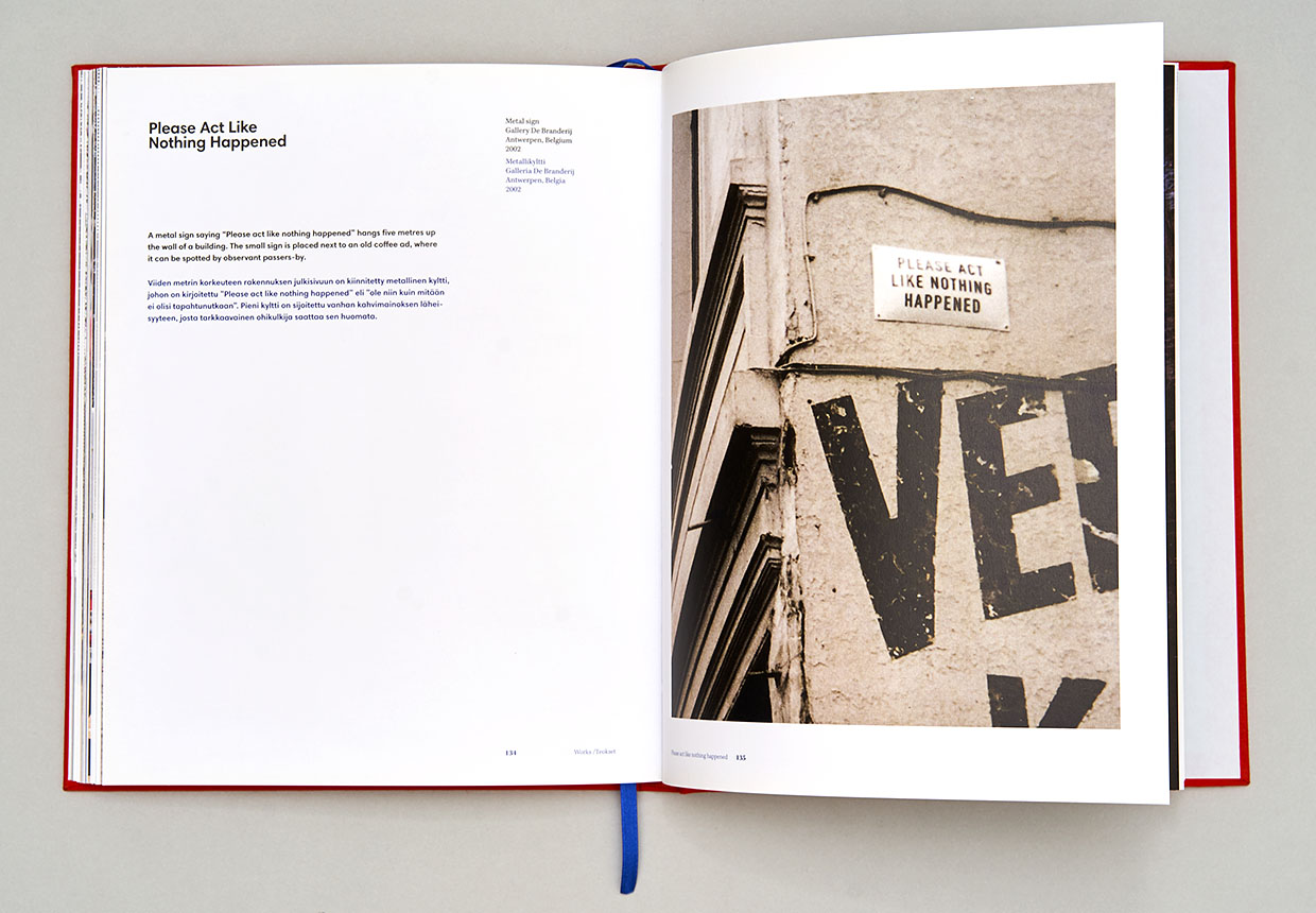
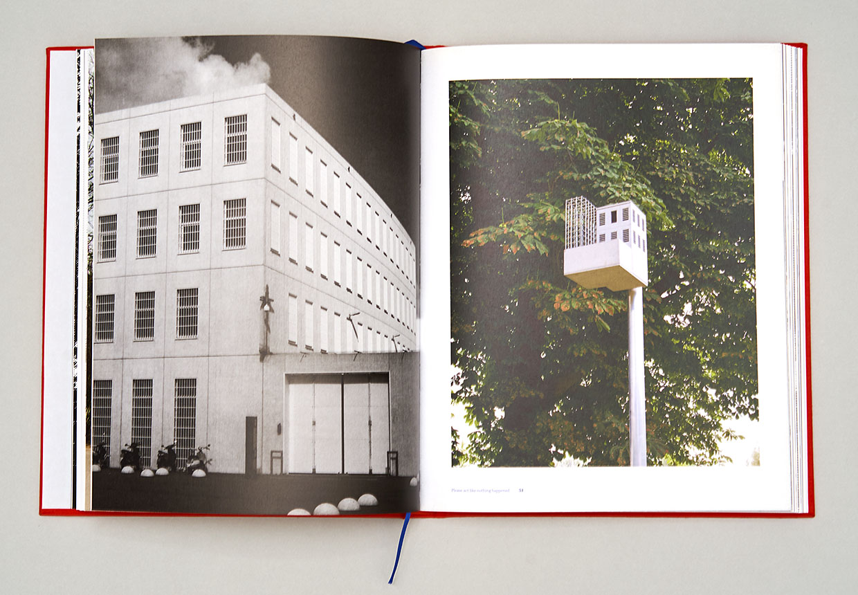
Otto Karvonen
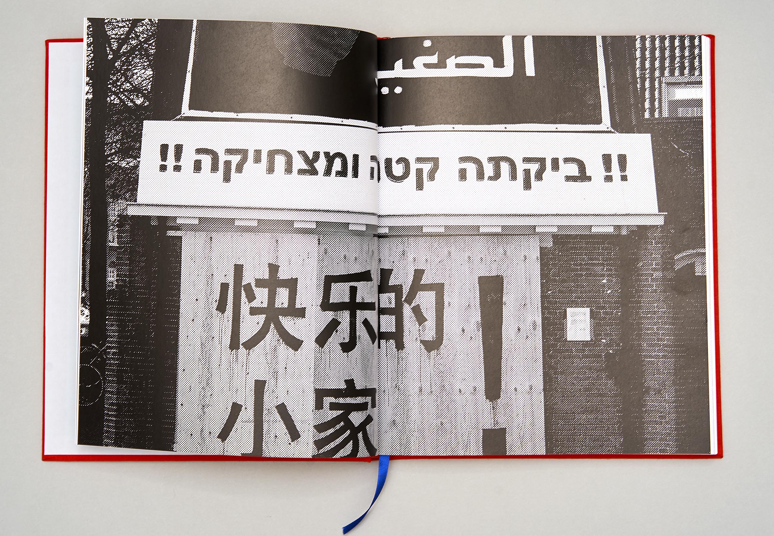
The use of high-impact typography here springs from Karvonen’s works, which frequently borrow their outward appearance from the torrent of visual information in urban space.
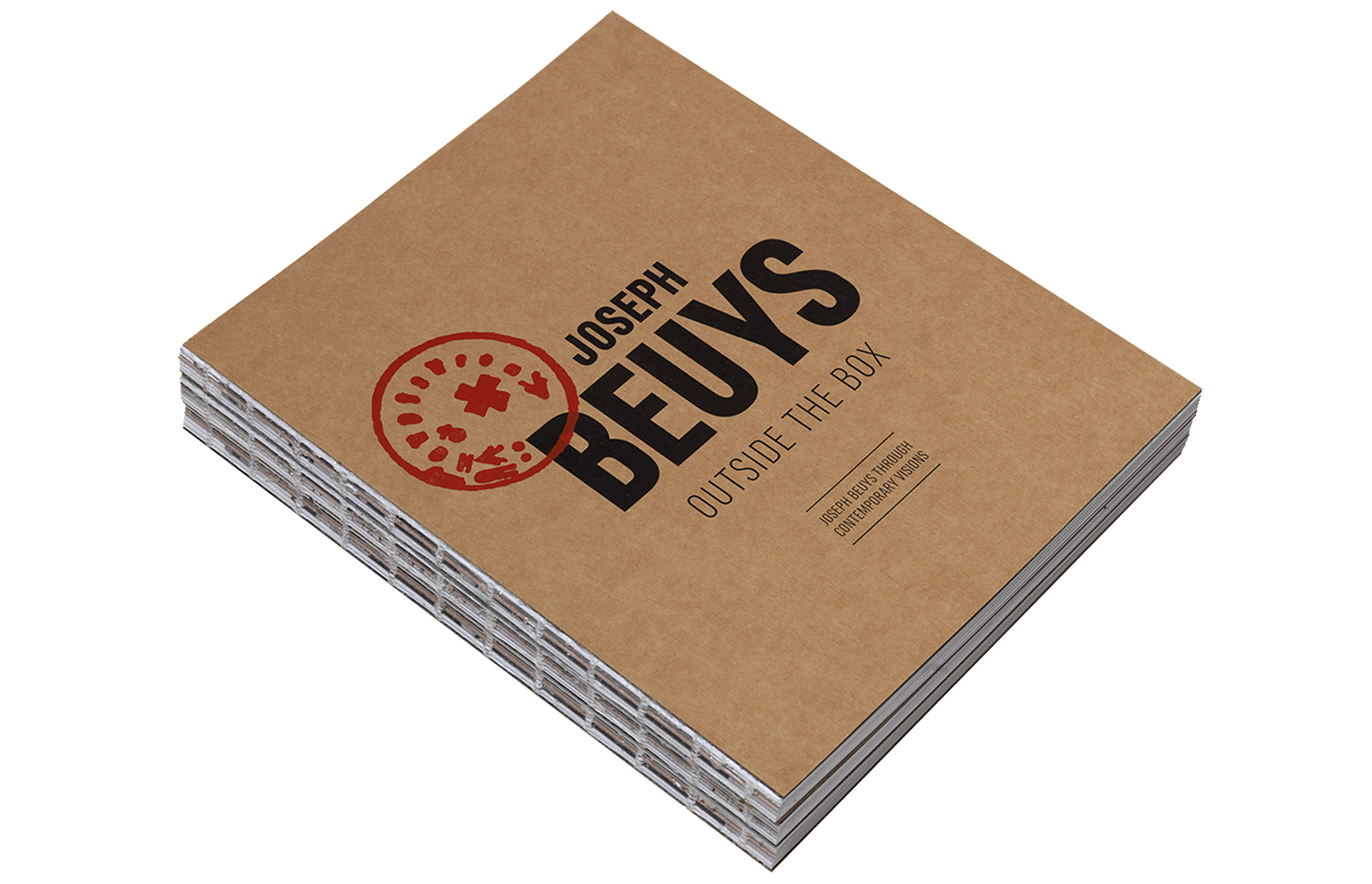
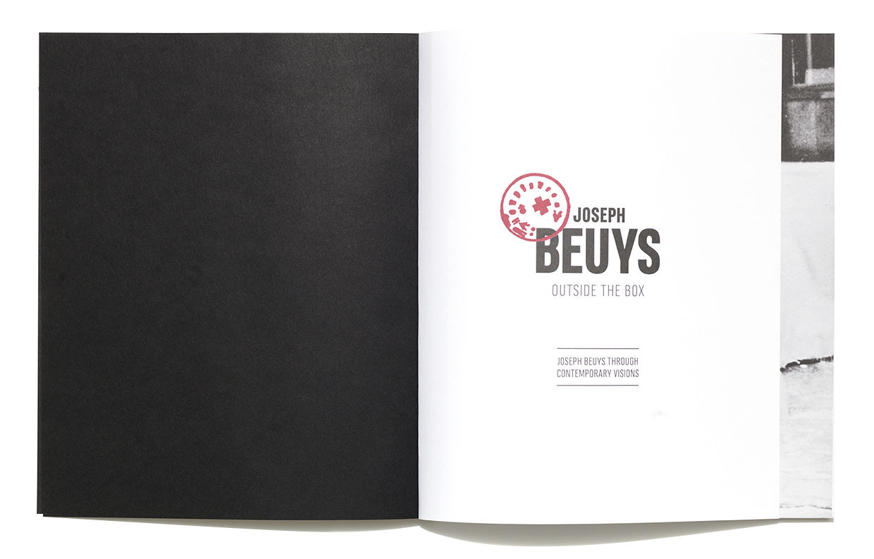
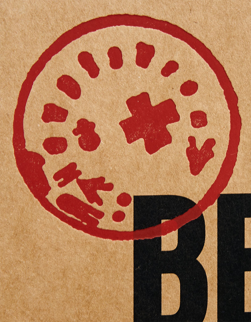
Joseph Beuys – Outside the Box
The brown buff cardboard of the covers, the folio printing method and the exposed spine seamlessly carry on the look of the exhibition.
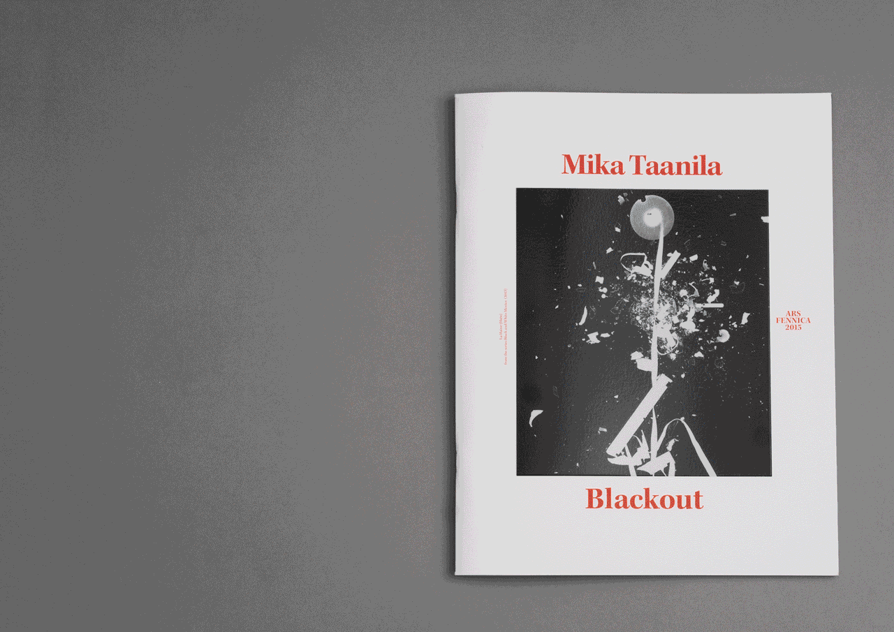
Mika Taanila
The idea behind Mika Taanila’s exhibition catalogue was to give striking prominence to the coarse quality of the works’ original materials and image of the zeitgeist.
Antalis Print Award prize 2015
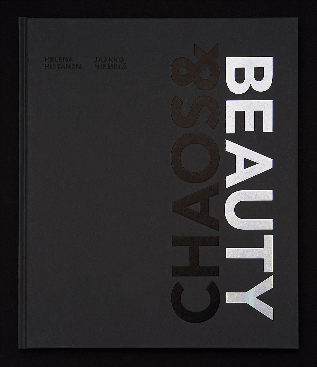
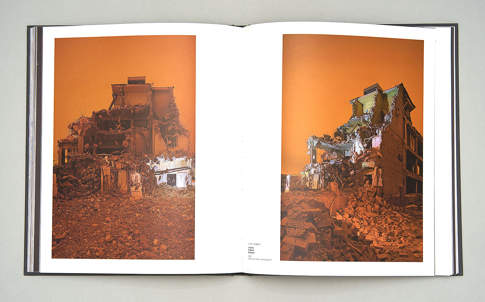
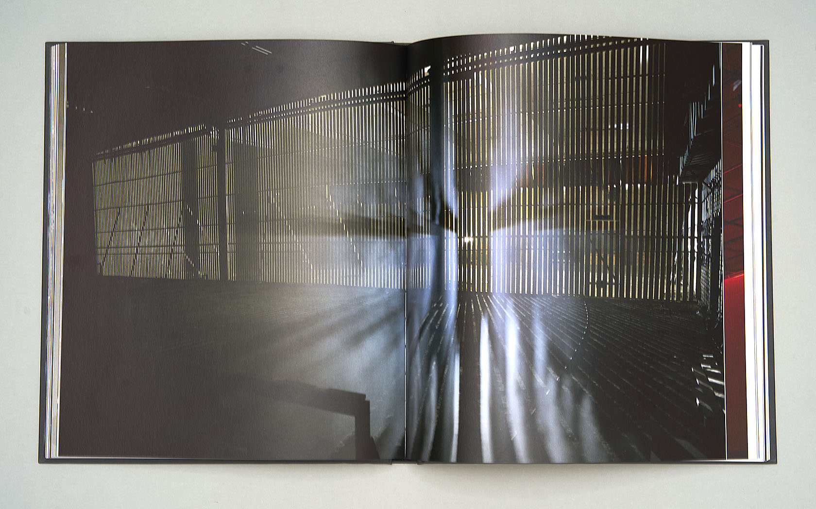
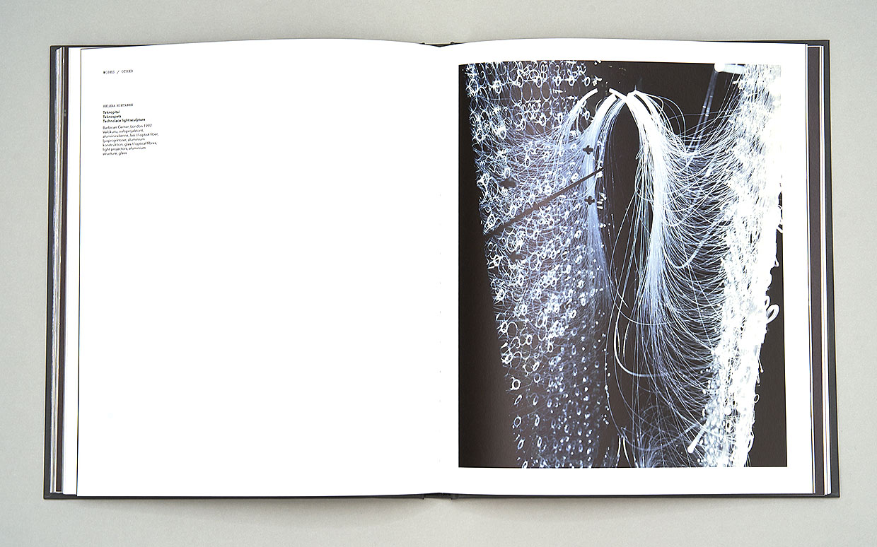
Chaos & Beauty
Chaos & Beauty profiles an artist couple who work both together and separately. Its appearance mirrors the light and shade that Helena Hietala and Jaakko Niemelä love so much.
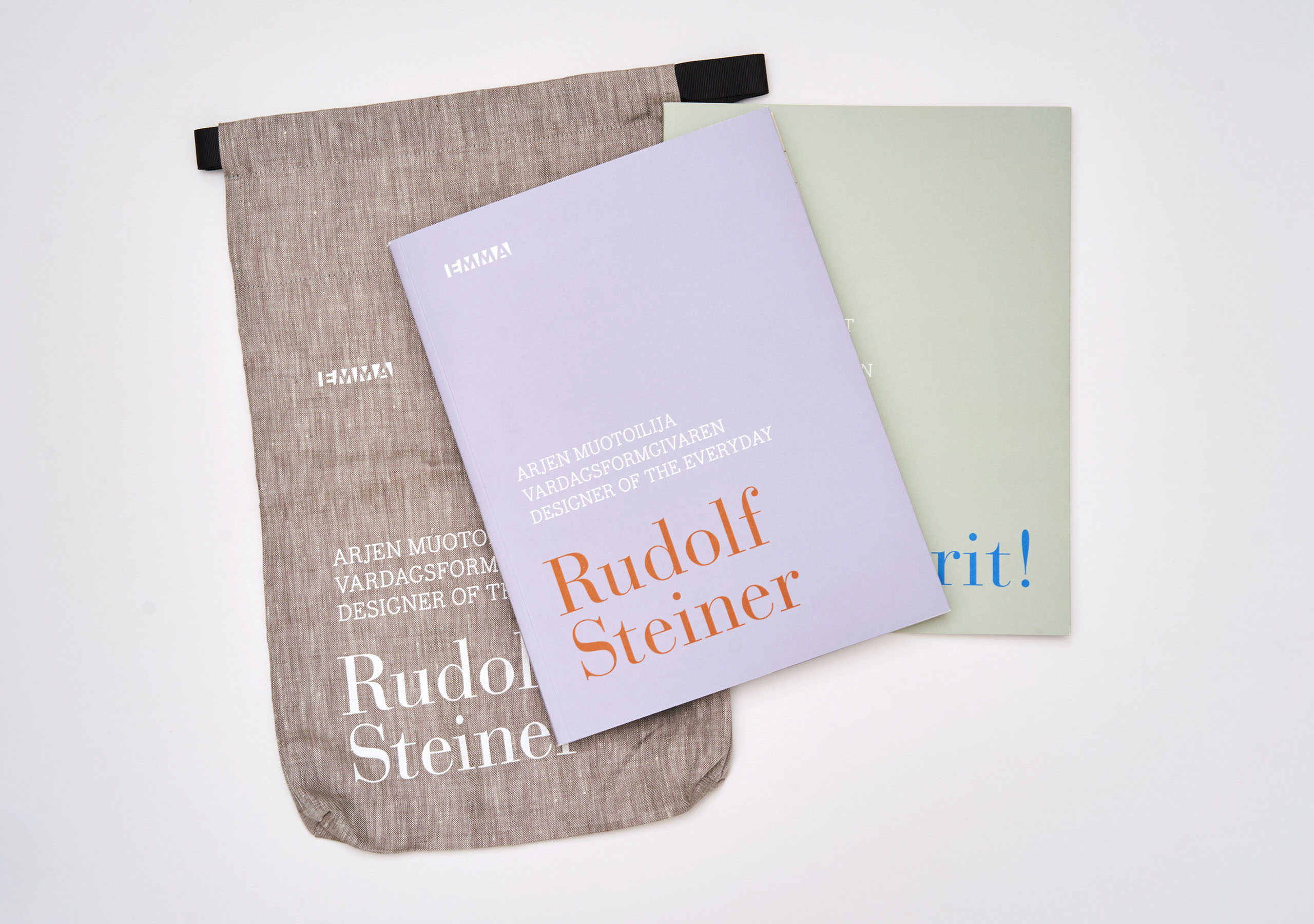
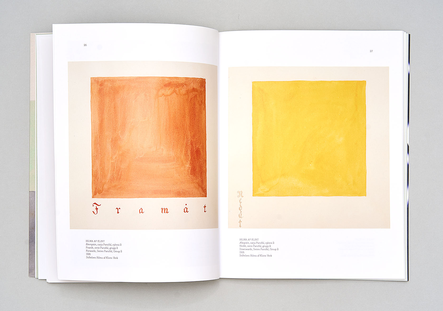
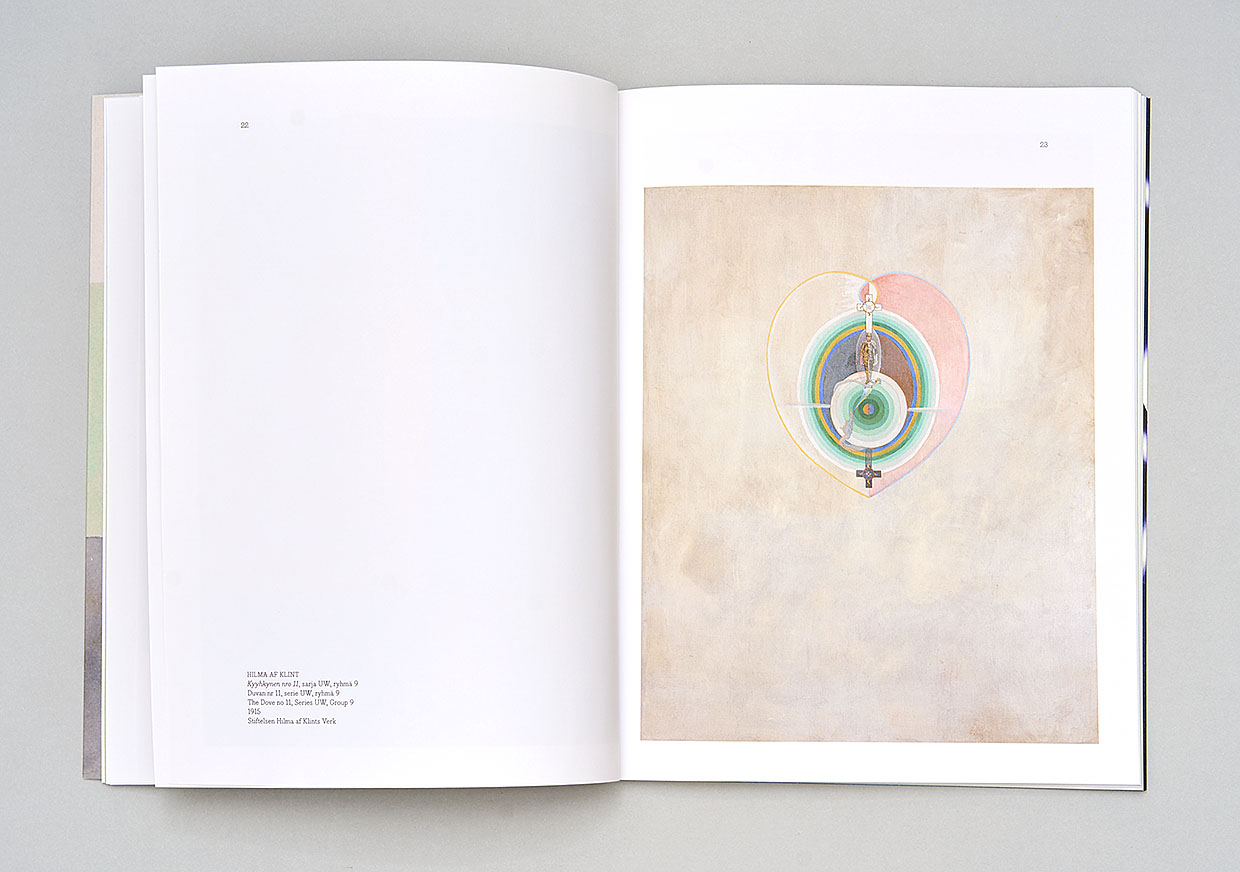
Designer of the Everyday, Rudolf Steiner & Feel the Spirit
Two exhibition catalogues fit into the same linen bag; one explores spirituality in art, the other showcases Rudolf Steiner as a designer of everyday life. The materials and colour palette were influenced by Steiner’s ideas and the works of Hilma af Klint.