In honor of its 80th anniversary, the Chemical Industry Federation of Finland has refreshed its brand identity. Their last makeover, also in the hands of Dog Design, was 10 years ago. Congratulations to the Federation and thank you for your trust over the years.
Responsible care is the basis for all activities at the Chemical Industry Federation of Finland. The new look also aimed to put the chemical industry in its rightful place at the forefront of industry.
A strong and clear brand image boosts self-esteem. Graphic elements are used to create Interesting and changing perspectives – Chemistry is the most creative industry in the world.
In the new image, the elements work separately or in combination with each other, just as chemistry, as a constantly evolving natural science, brings together different people and disciplines.

“Dog Design fulfilled our vision beyond expectations. We wanted our brand image, based on accountability, to reflect the innovative work of the chemical Industry and the companies we represent. In the hands of Dog Design, our ideas came to life.”
Sonja Ulma, Specialist, Communication,
The Chemical Industry Federation of Finland
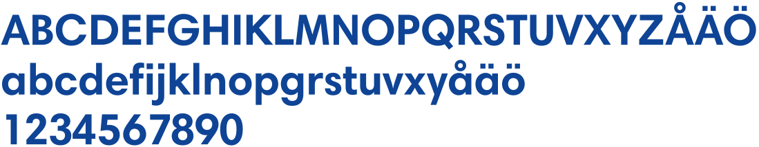
Typography and Its Uses
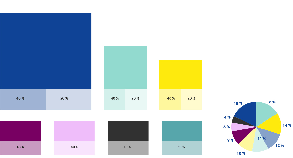
Colors
The look of the Chemical Industry Federation of Finland
has three brand colors with a clear hierarchy.
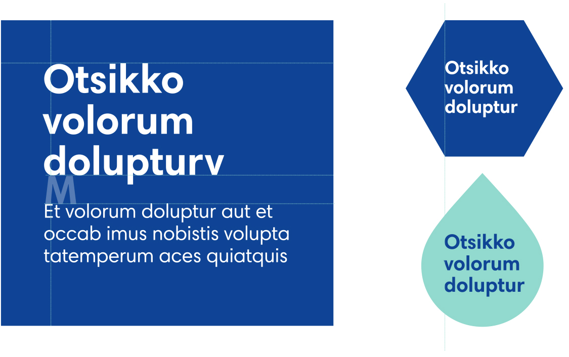
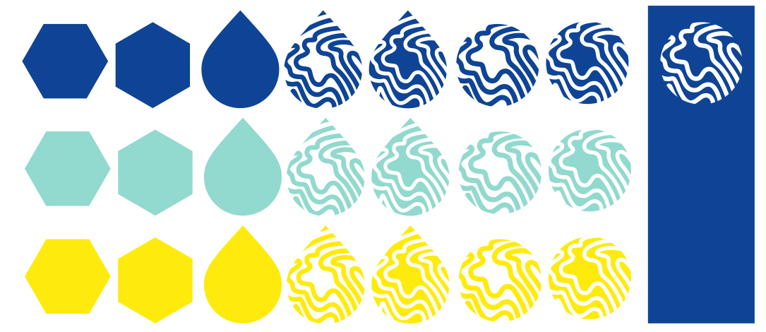
Graphic Elements
Distinctiveness and recognizability are created for the Chemical Industry Federation of Finland’s identity using three graphic forms. The droplet, the crystal and the globe represent the three basic states of matter. The globe motif highlights the chemical industry’s all-encompassing commitment to responsible care.
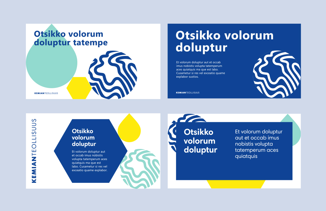
Presentations and banners
Some
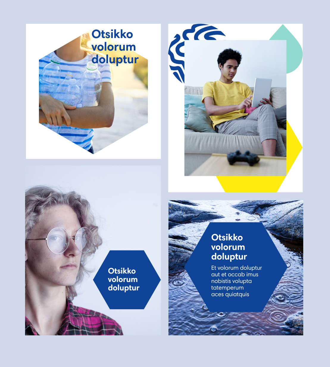
Images
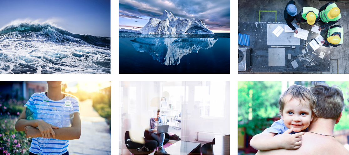
The chemical industry’s picture gallery was harmonized
by adjusting colours to match the new look.