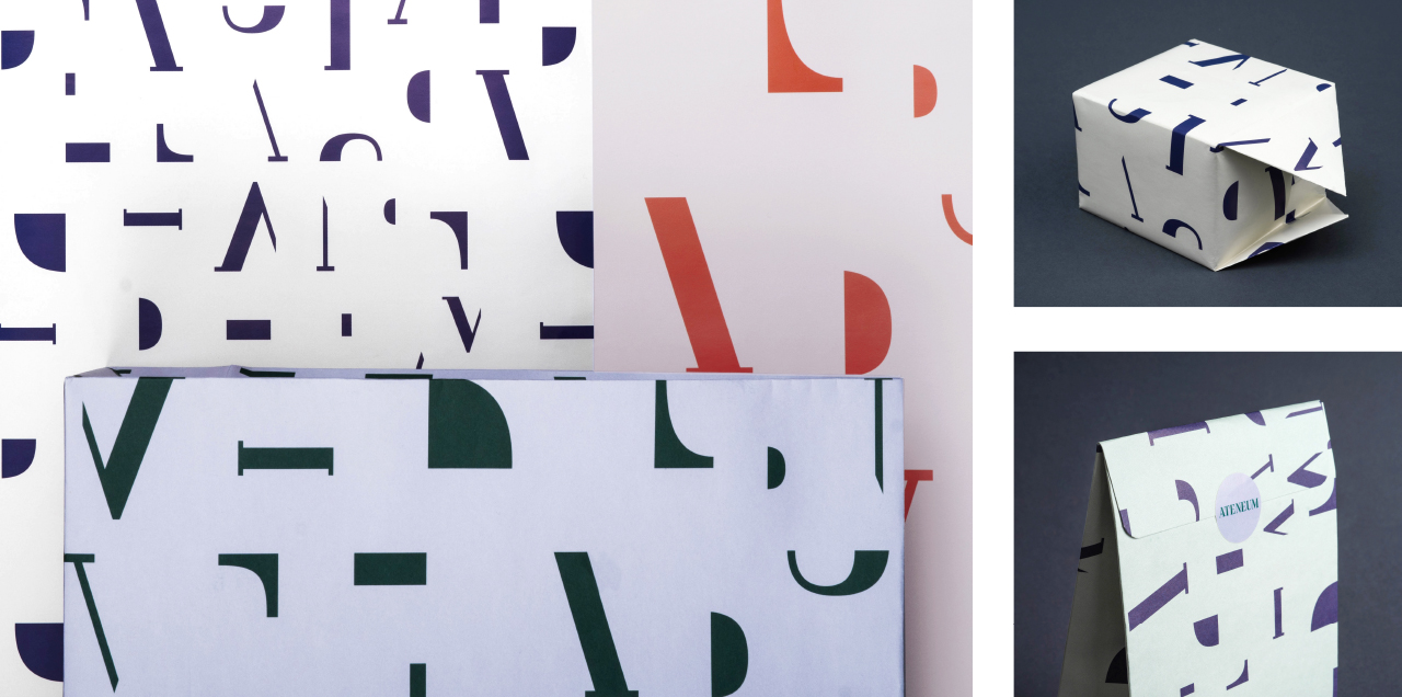
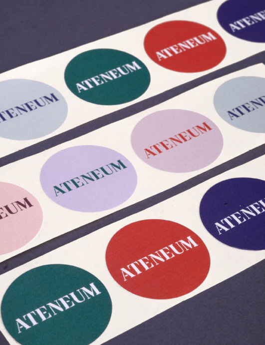
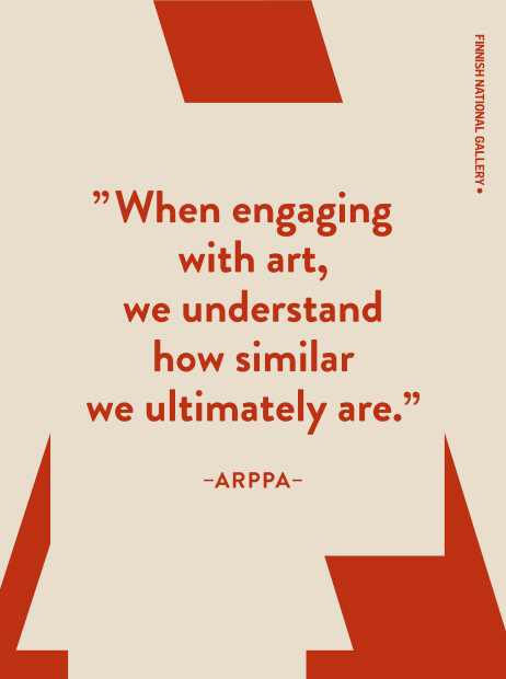
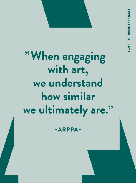
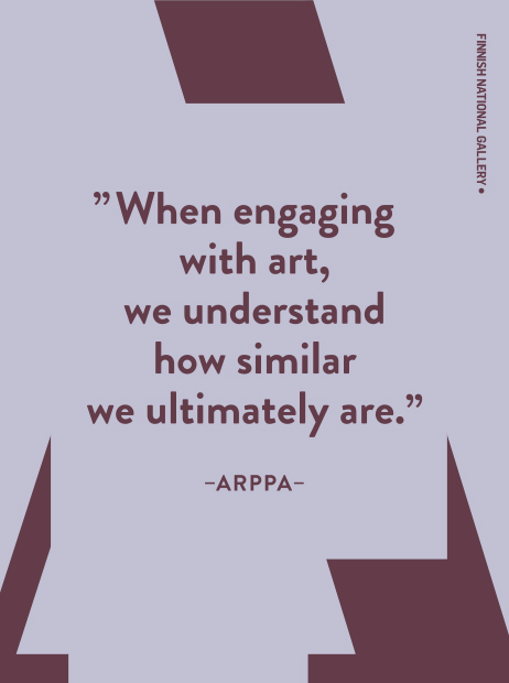
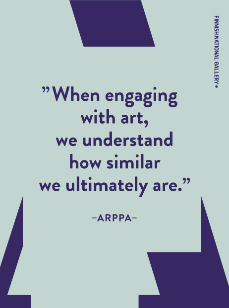
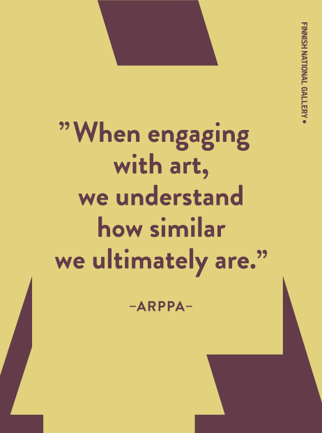
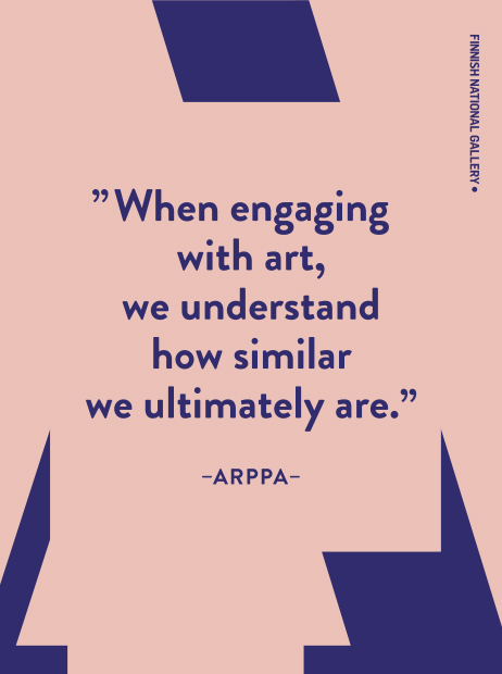
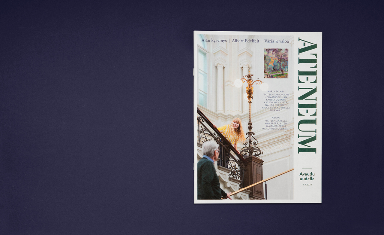
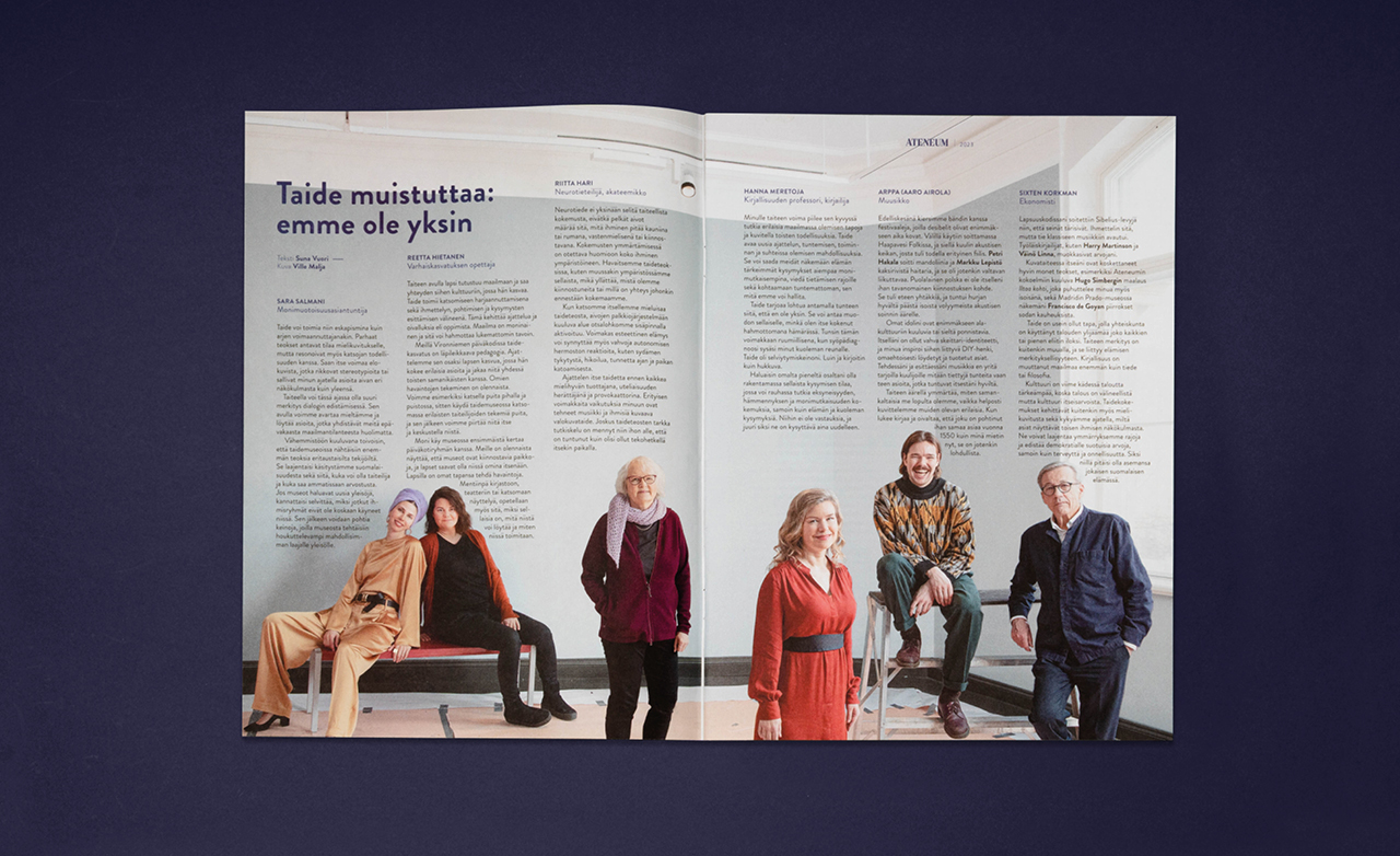
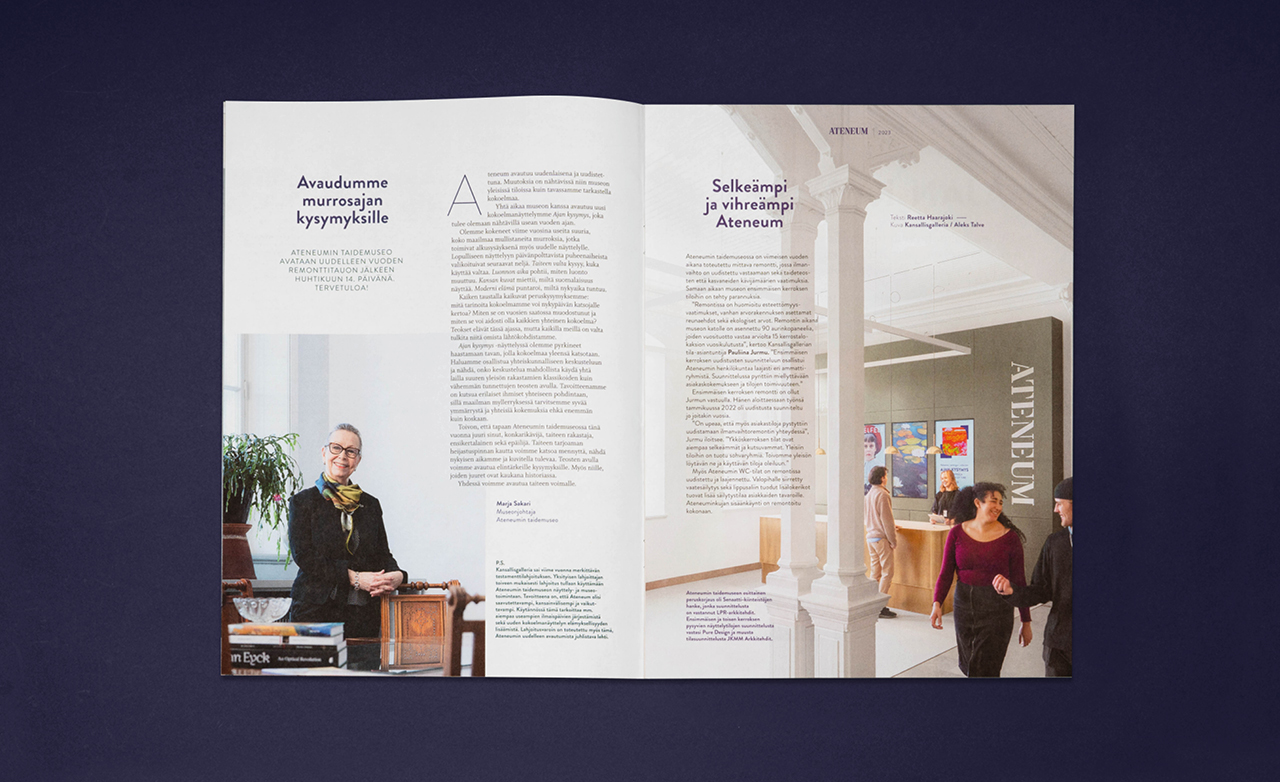
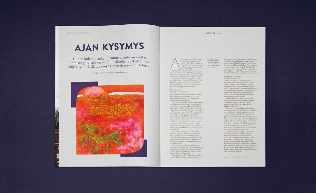
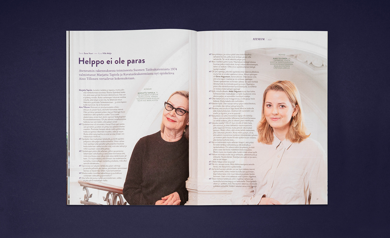
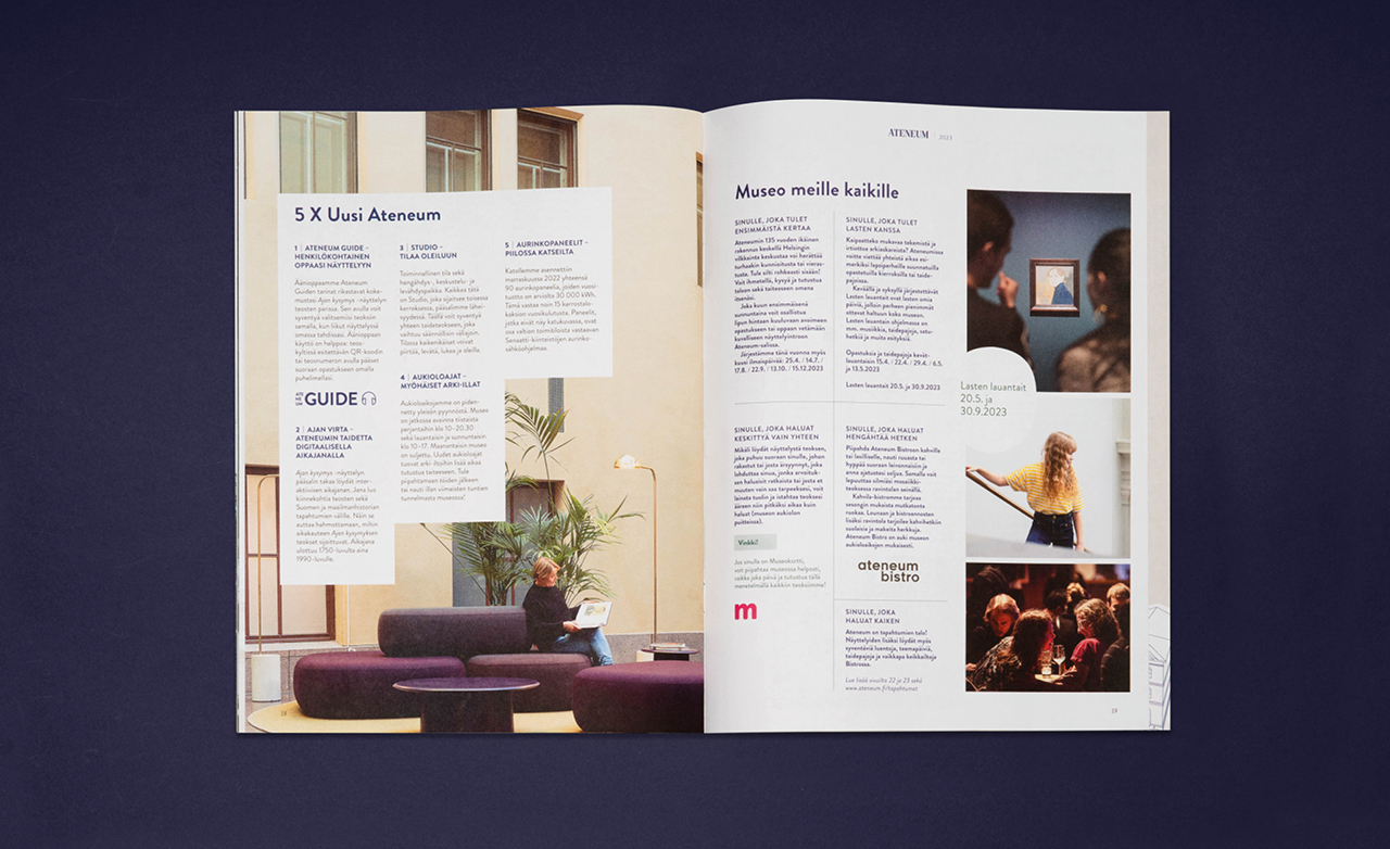
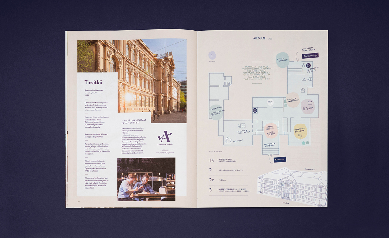
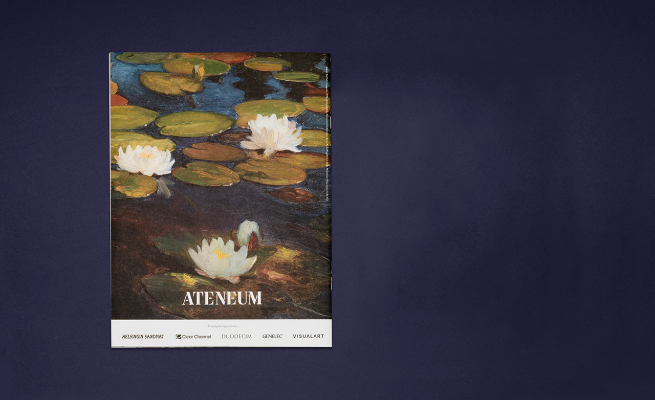
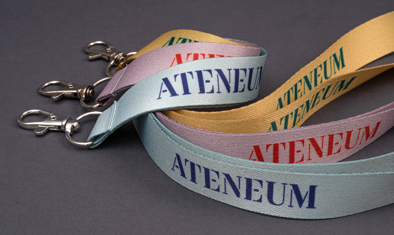
Dog Design has updated the Ateneum’s brand image. The bold use of color and the iconic logo are central to the redesign. The animated logo is constructed from parts of a stencil font. The same elements form a surface pattern, and these shapes can also be viewed separately. They frame or highlight the content and the art itself.
The new look serves a variety of marketing needs while reflecting the institution’s values and renewed identity. The Ateneum invites us all to “open up to the power of art.” It offers its visitors timeless beauty and an opportunity to reflect on the burning issues of the day. The Ateneum is open to all.
“The team at Dog Design has excellent insight into the visual design for an art organization, and in building a consistent and up-to-date brand image.”
Suvi Rusanen,
Marketing Manager, Ateneum
The colour palette is
both bright and
down-to-earth.
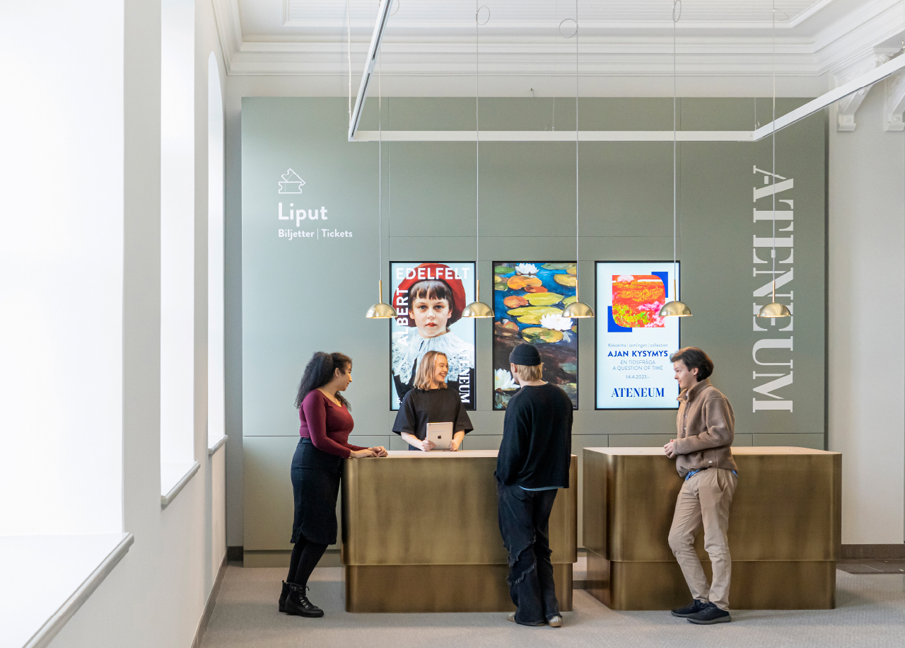
Interior design by Päivi Meuronen / JKMM Architects
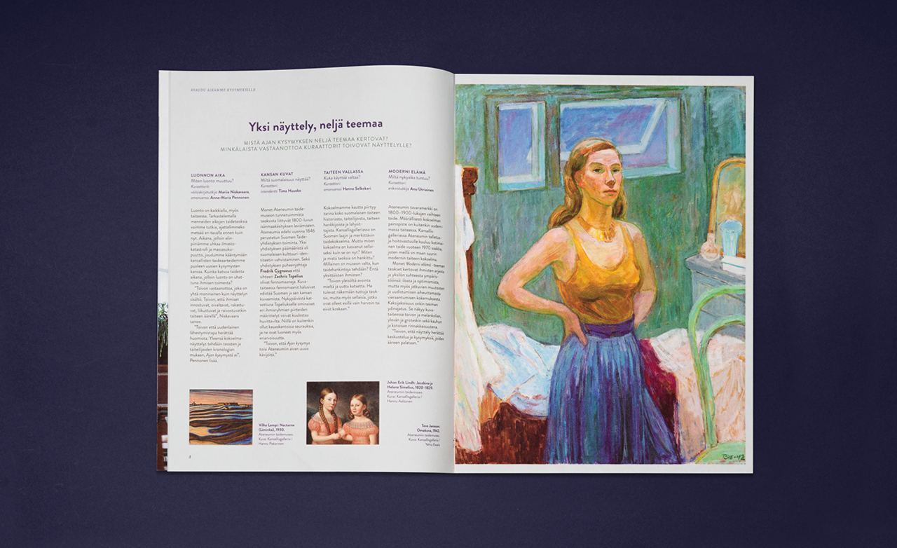
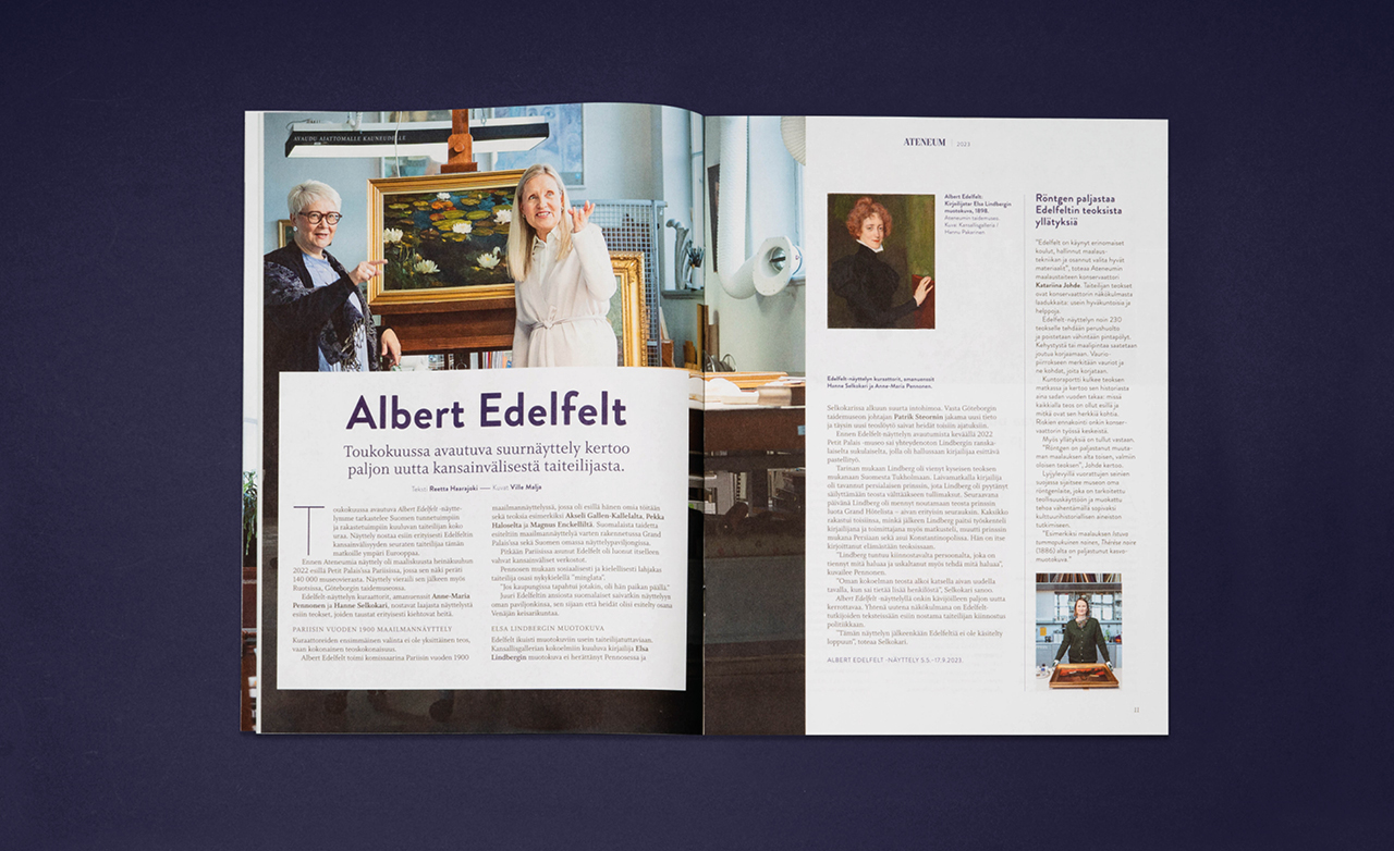
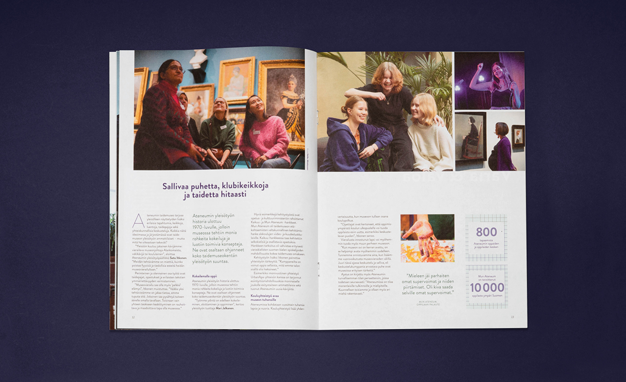
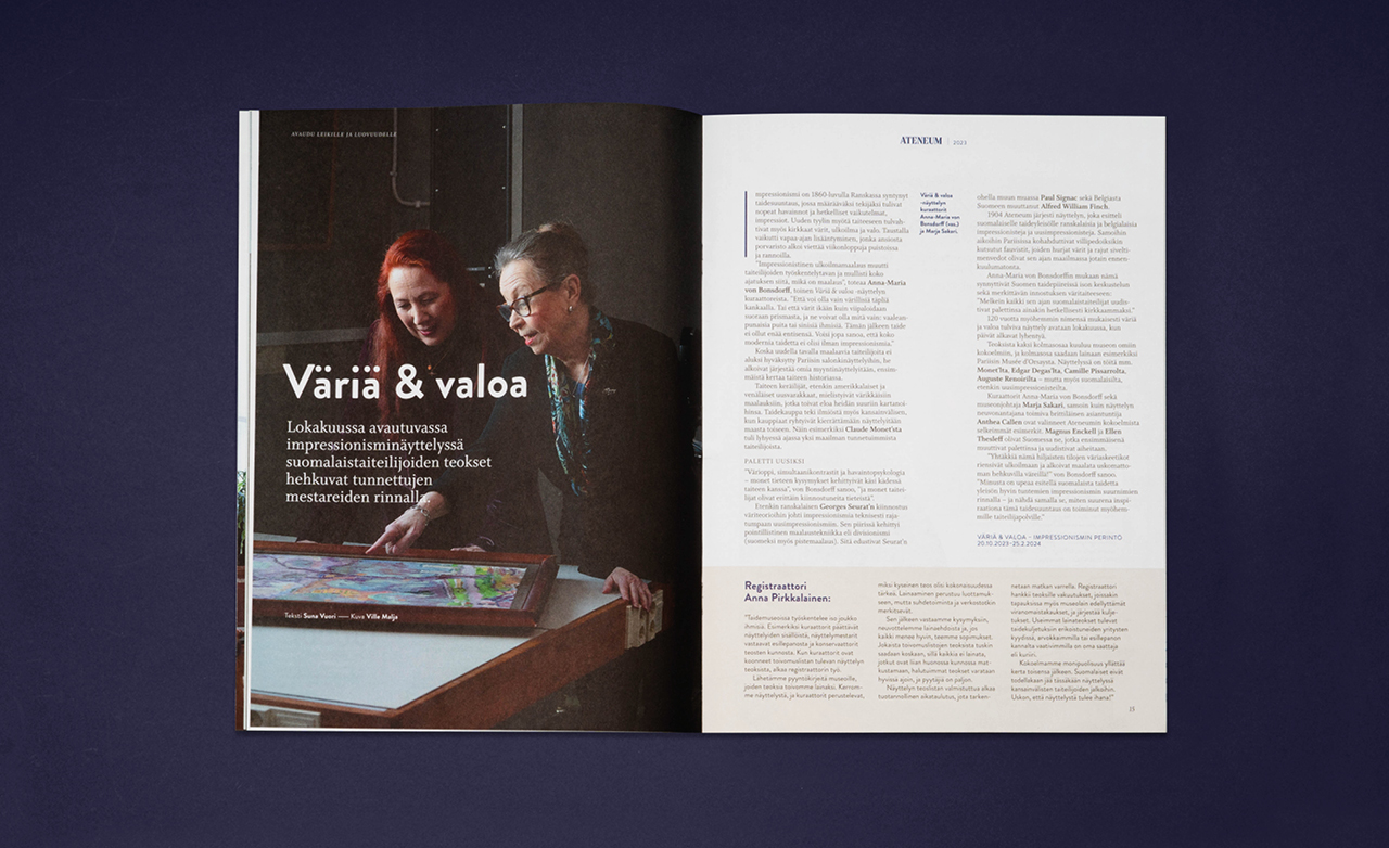
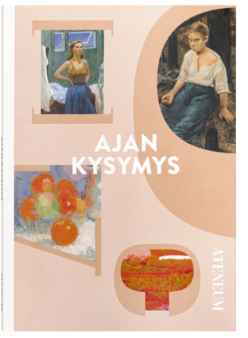
Through people, the magazine presents a restyled Ateneum.
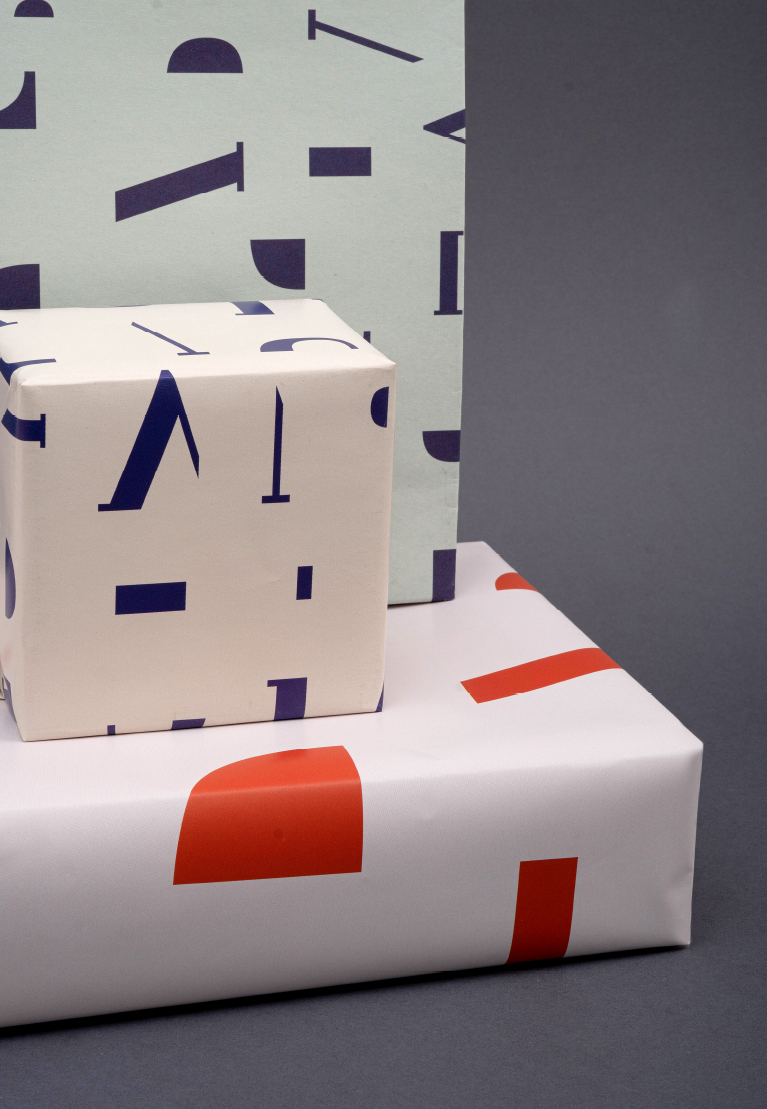
The image is constructed from the letter forms of the Ateneum logo’s stencil font.
