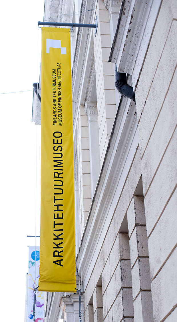
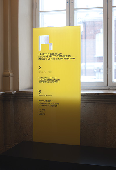
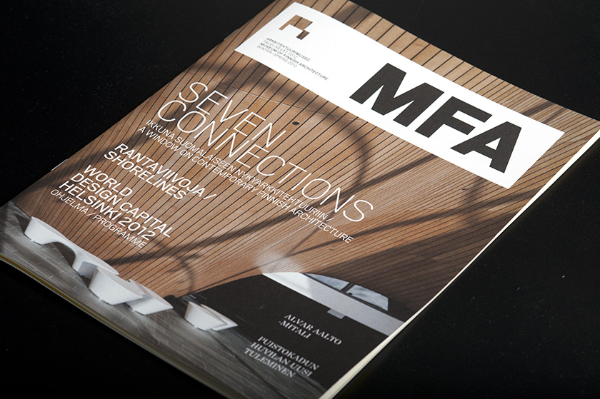
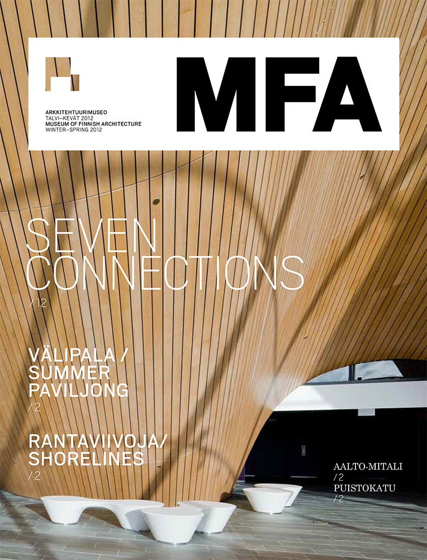
The Museum of Finnish Architecture began work in a Neo-Renaissance building designed by the architect Magnus Schjerfbeck in 1899. In 2011, to coincide with a change in its Finnish name, the museum’s identity was also given a new look.
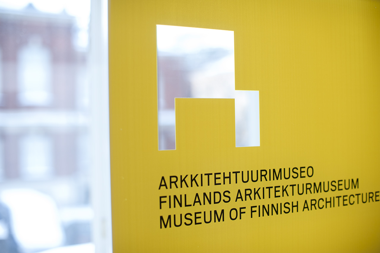
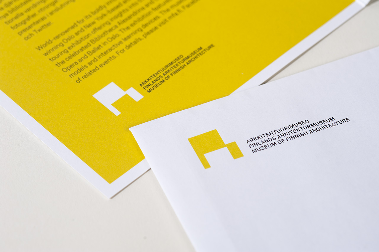
The Museum of Finnish Architecture’s current logo is a detail of the dimensional drawing by architect Juhana Blomstedt that the museum previously used. It can be seen as the letter A, a gateway, a square, an aperture, a step… The bright yellow of the identity invites today’s visitor into the historically valuable museum.

A&O Museum of Finnish Architecture’s Learning Content
“Design, build, play, learn!”
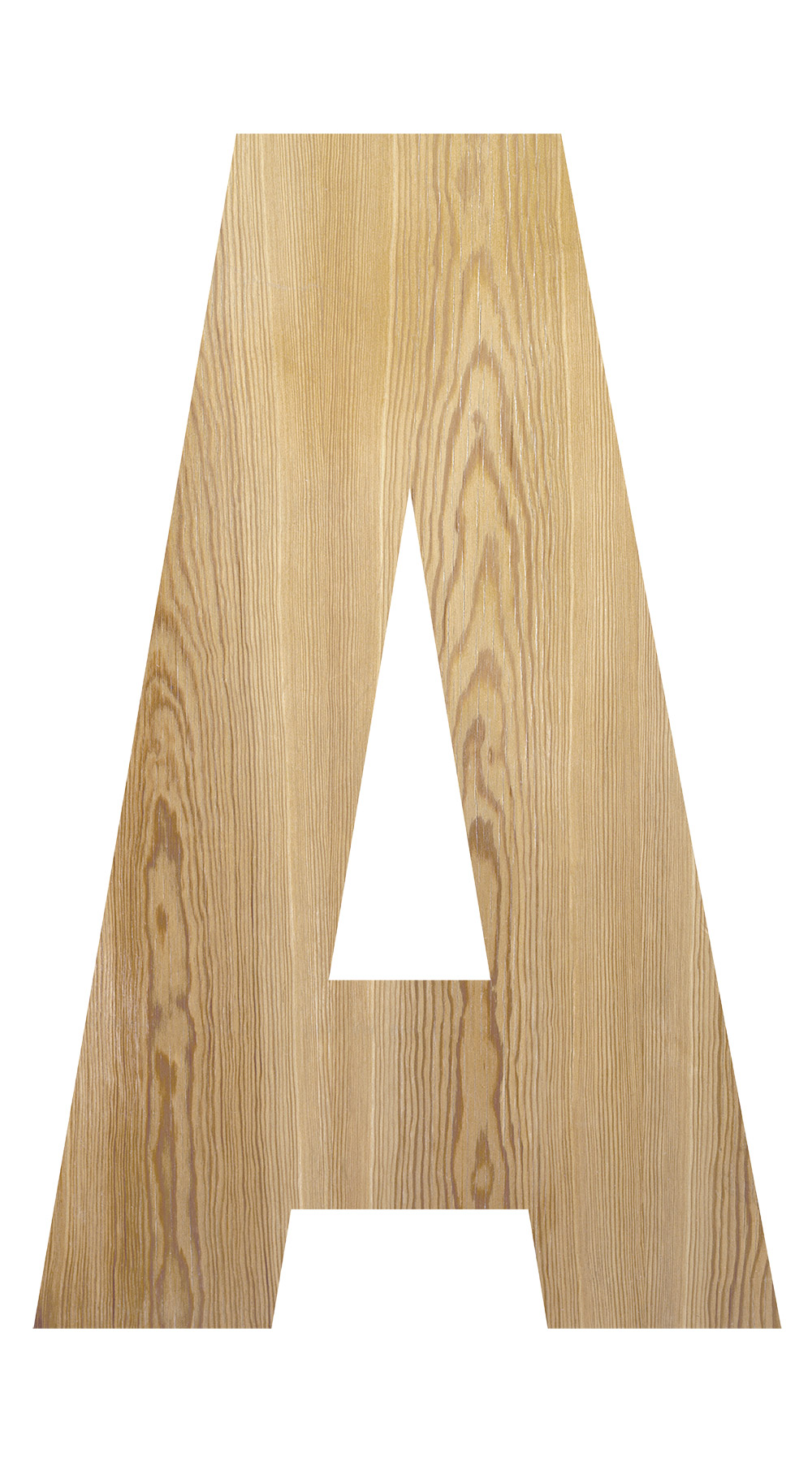
A&O is a set of teaching materials aimed at children and other teaching groups, in which the basic concepts for architecture are opened up though play and work assignments. A&O’s identity is illustrative, variable, and is an invitation to play. The letter A that we designed uses various materials and textures. In fabric-covered superlon foam it becomes a building block or partition. The letter O, in turn, is constructed out of dots, and can act in space, for example, as a self-illuminating object or even a mat. The yellow and purple form a strong pair of colours.
“The Alpha and the Omega of everything!”
