Merkki is a space open to all to responsibly engage with and explore the phenomena of communication.
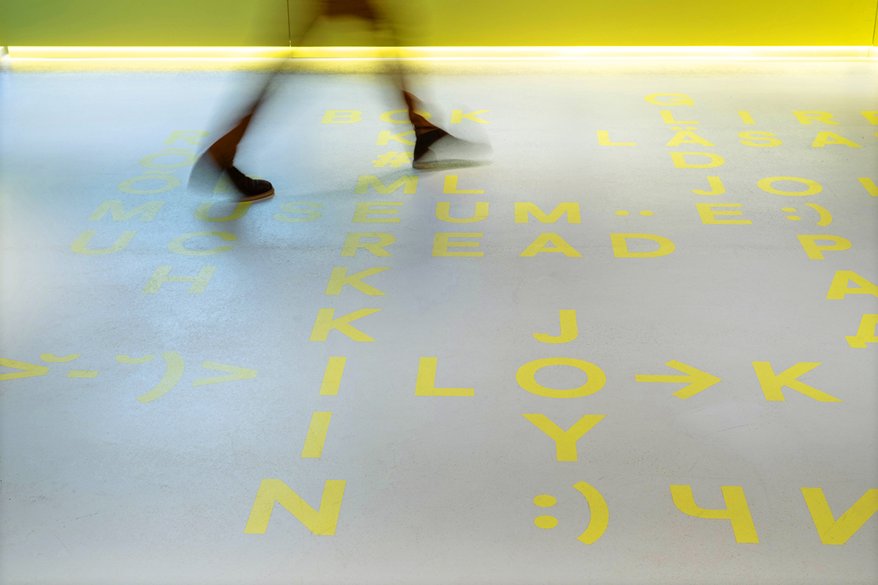
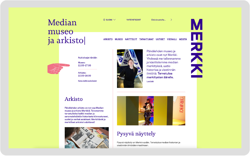
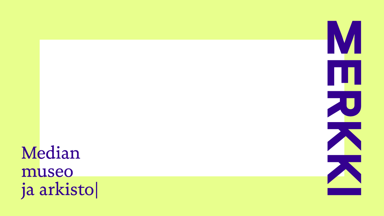
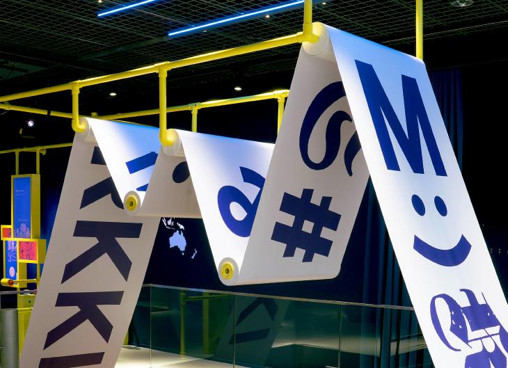
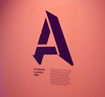
Merkki provides tools to navigate an imperfect world where information does not add to distress. Merkki’s logo is like a totem or beacon that attracts attention, invites and promotes conversation. The colours create a positive and fresh environment where you can slow down and reflect on even more serious topics. Inky blue, warm magenta and daffodil yellow have taken their inspiration from newspaper four-colour process printing. The typography also reflects the traditions of the printed word. The yellow frame used for Merkki illustrates journalism’s mission to provide reliable information. Typographical symbols and vignettes from Merkki’s own archive serve as graphic elements for the visual look.
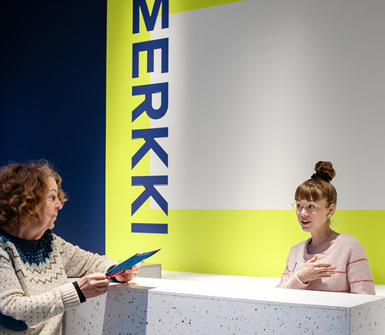
The rebranding of the museum and archive’s daily newspaper also included a naming. The makeover started with defining an identity, for which we invited concept designer and copywriter Tiina Kaakkunen (Istu ja Pala Kaakkusta). In workshops, together with the Helsingin Sanomat Foundation and the staff of the revitalized museum and archives, we uncovered Merkki’s personality, values, and the attributes defining the visual look.
Merkki has been given the important task of promoting quality journalism, freedom of expression and responsibility. In Merkki’s launch campaign, a yellow frame delineates space for freedom of speech. Merkki offers an open space for the written word among the esteemed pages of Helsingin Sanomat. How, and with what message, do you want to fill that empty space? We created the launch campaign and marketing materials together with Tiina Kaakkunen.

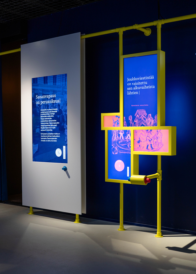
Dog Design, along with Panu Heikkilä (Fantomatico) who led the exhibition design and implementation project, as well as Susanna Partanen and Riikka Savolainen who designed the exhibition concept, was part of the exhibition design group. Riikka and Susanna’s proposal was selected from among assignments aubmitted to an Aalto University Exhibition Design course.
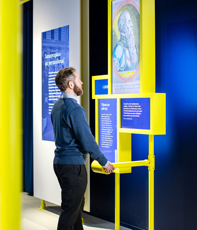
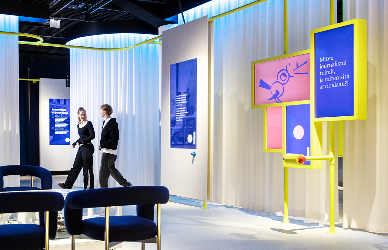
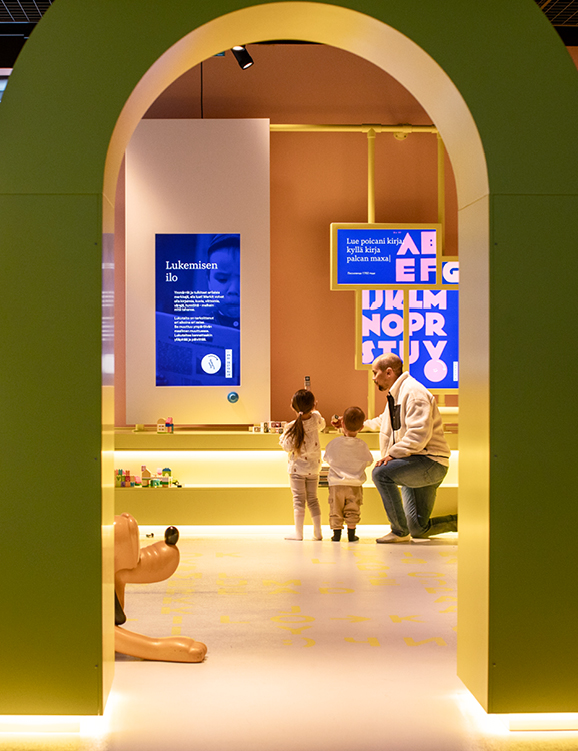
Merkki is a part of people’s lives – a place where people go for more than just the exhibitions. Merkki is open to everyone – for both those with literary proficiency and those who want to develop it. Merkki’s facility is bright and open.
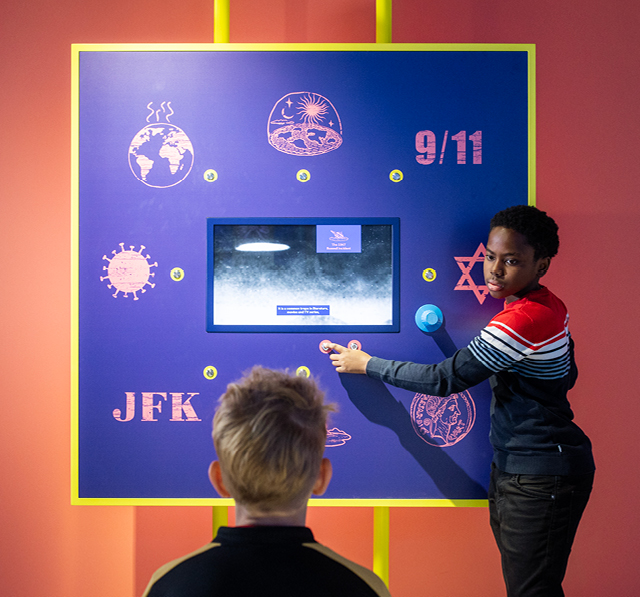
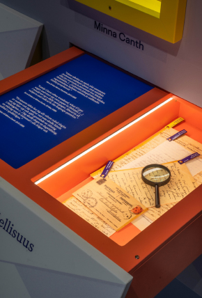
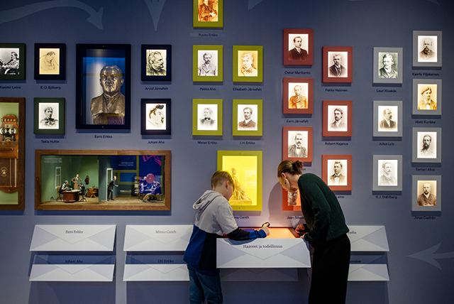
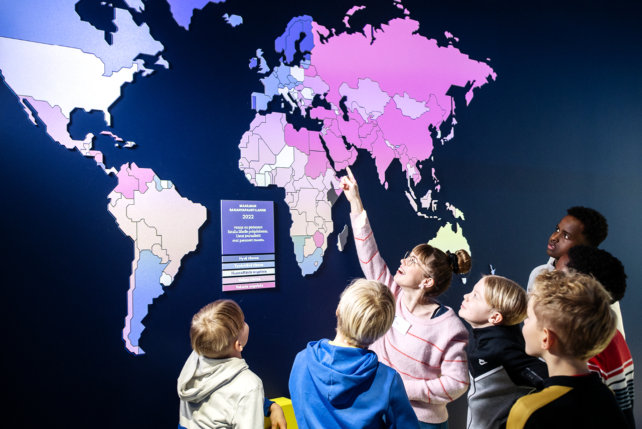
Information is presented on screens where the visitor can control how quickly and how much they explore each topic. The visitor’s involvement and the opportunity to delve deeper into the important themes of the exhibition have been reinforced through playful objects, with boxes that can be opened and items that can be touched. In addition to graphic design, Dog Design was responsible for the production of new videos and moving images. There are seven languages options to choose from at the exhibition.
“Dog Design was a key partner in Merkki’s rebranding. They brought strong experience and fresh insight to a demanding project and were involved in almost every stage of the work; from defining identity to developing storytelling formats and creating visual identity. We think the end result is absolutely stunning, and we particularly want to continue to develop Merkki together with Dog Design.”
Saila Linnahalme
Director of Merkki